Just some nit picky design things to think about.
Firstly, the artwork and how its laid out looks super nice.
My recommendation is from the perspective of a person who has never used the application or is new to using streaming apps.
From either the libraries menu or home menu, when looking at recently added items or continue watching etc.

If you don’t notice the small text and tap on an item, and then hit the big Watch button that pops up in the middle of the screen. One might get a bit lost and not know if they are watching the whole season or if they are watching an episode. Obviously if you are paying attention you won’t be lost, and if you click on one and through using the app you will learn that one is a episode and one is a season. However, this can be easily overlooked and maybe a bit confusing for newcomers.
I did notice that Season 1 is listed under the name of the show with a small episode count in the top right of the thumbnail, and then for episodes it displays the name of the episode with episode number and other information.
My recommendation is maybe adding Season or Season X or Episode or Episode Y right next to where it says watch. For example see below screengrabs and edits:
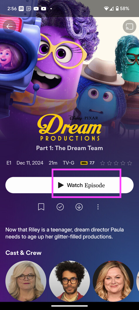

Not sure how much value add is there or how difficult it is to add this kind of behavior to the button. If it seems repetitive cause it says season 1 just above the watch button. Maybe drop the season 1 from above and just have it shown on the watch button? Just wanted to offer up the recommendation.
Thank you all for your hard work on these apps.