I’ve been using the Roku preview now for a week and there are a few things I think could do with being changed, and I don’t think the changes I am mentioning are only limited to Roku as I believe the behaviour is the same across all devices that have the new experience.
- The top nav bar should be hidden if nothing is currently selected (ie scrolling down a page) - the way it works when you click into a Show/Movie.

Why? Because in my opinion, it makes the art work look ugly, and if you are scrolling, then you wouldn’t need to access those buttons anyway. They should re-appear if the back button it pressed as like the current behaviour it would just fling you straight back to them even if you are at the bottom of the page.
- The side bare should collapse so the entire page can use the full screen, and then the left button would bring them back if needed
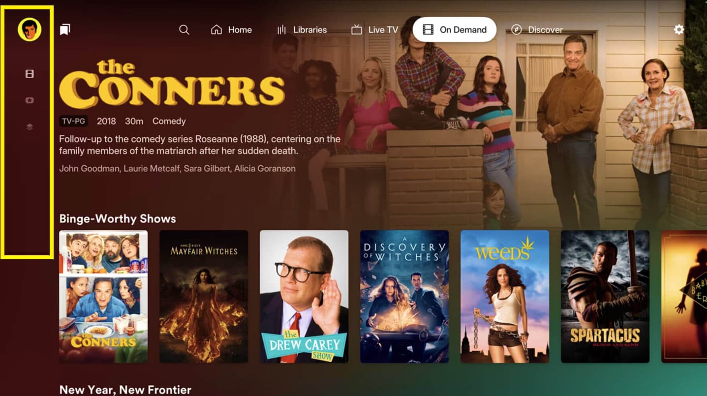
Why? Again, it looks a bit ugly having so much empty space that could be used for more posters being displayed. The left nav doesn’t extend all the way down and is typically only 1 or 2 icons right at the top, including the “profile”
- The time should be brought back to the home screen like the old Plex layout.
Why? Why not? It should never have been removed.
- The Live TV has the biggest open space on the left hand side, why? I don’t know. I don’t have a picture of this but, let me tell you its ugly and cuts more than half of the TV guide listings when you factor in channel names/logos.
Other than the things I’ve listed above, its a solid first release for the BETA and with the refinements listed above, can only get better.