I debated this a little bit when writing my update. You opinions and feedback definitely mean a lot to us and my opinion is that locking this post feels like I am shutting that down a little bit So while I am serious that I will try and make this my last post in this thread ( since I tried to do that in my previous post), if you all want to keep going here feel free, just know that myself and others from Plex might not be around to follow along with and contribute to the discussion.
editing this a bit as when I re-read it didn’t feel clear in intent. I had originally stated: “Ultimately, my opinion is that your opinions and feedback do matter to us and locking this post feels like I am shutting that down a little bit.” Edited to: “You opinions and feedback definitely mean a lot to us and my opinion is that locking this post feels like I am shutting that down a little bit.”
I think we’re good for a lock. No sense in continuing here if it’s not going to be seen by parties that matter. Some may not bother to scroll back up to see that there’s a new thread when it could easily be found if it’s near the end.
Well if you’ve been using PLEX for 10+ years you’ll know there are still bugs in time shifting live TV and other fundamental things that haven’t worked properly since introduced. And we went through the same multi-year threads that were “in the interest of progress” closed and people suggested we just move along, burying the “outrage”. Seems like the playbook is still in use.
Constructively, I’d rather see fundamental bugs have the focus over moving some menus around and adding “clicks” in the “new and improved UI”!.
Exactly @Smokindog , this is part of Plex’s normal business practice.
So, are you implying that this is going to change with a new app?
So yes, my experience with Plex has strongly influenced my expectations with regards to features and bugs.
For anyone to expect anything different if delusional and counter productive.
Re what you would rather see:
I hear you, but if they are working on the UI, shouldn’t they just fix it now, or do you think they should wait a few months or years and only fix/improve the UI, after all other problems have been solved?
You need to go back to the drawing board and start OVER. In the meantime give us the old interface for Roku. Who thought it was a good idea to remove the LIST option in movies?
Literally first time I felt the need to complain about plex. Fire the idiot who thought to get rid of the side bar access to libraries and put them back. Thank you.
The utter disregard for user choice of what should and should not be easily accessible, on the home screen, and quick to access in the new UI is very saddening. Users user to be able to disable discover and other features to hide them from the homepage, but that no longer works. Users used to be able to select what is pinned in the sidebar for quick access, but now the closest thing to pinning doesn’t make anything faster, instead of puts all non-hearted items into a sub-sub-menu. Users used to be able to hide features they didn’t want, like watchlist, now they cannot. This new UI ignores user choice and is a complete downgrade in UX, is slow, buggy, and overall unpleasant. 0/10
I would be able to tell you if it were at all usable, the Roku remotes can no longer navigate plex, like AT ALL. If they move enough for you to be able to pick something there is no reaction, nothing plays, it doesn’t even attempt to play, just sits there doing nothing, maybe plex will give it a job as a developer.
This new update is a train wreck. We can only intermittently access the top menu. This means at times we have no access to our local library. We found the hidden secret to organizing libraries, however Playlists is no longer available to include. Playlists is also missing half our playlists. I use these for watch parties and now this feature is unreliable as well.
We’ve really loved Plex and recommended it to others, until now. Intermittent access to our LOCAL library, unreliable features. Makes me want to look at Jellyfin. For a company that was just hacked and had such a terrible response with losing access to your server with no help files offering a working solution, this is not how you come back. Give us an option to go back to the old, working UI, fix your security, and remember why you’re here - being the best option to view and manage your local library. Or become Bud Light.
yup.. this thread has aged like fine old moldy milk.. didn’t take any of this feedback prior to today.. hahaha!! ahh.. plex.. i love plex too.. i want you not to fail now but.. this isn’t looking good.. just wait until all the tech news places catch wind of whats happening…
@Insomnic_1
“Exercise Videos, Concerts and Holiday would get their own Smart Collections using genre tags which I’d manually set and lock if they didn’t get picked up.”
Separate libraries provide a way easier way to separate anime, animated, adult, Exercise, Concerts and Holiday videos from standard hollywood TV Shows and Movies, since most don’t want to see those mixed in when browsing, and avoid a lot of work creating and maintaining Collections.
My comment was in response to how to manage some separate “genre” functions without using separate libraries since navigating between libraries can be more cumbersome in the new UI. I was providing examples of how labels and collections (particularly Smart collections) are a way to do it. Not really stating something was better or worse but Plex app design direction does seem to expect fewer libraries (and reps have said as much).
What you’re describing as the reason for different libraries - “don’t want to see those mixed in when browsing” - is kinda different than what I was addressing with my comment but still doable. You could do that with Collections by setting the collections view:
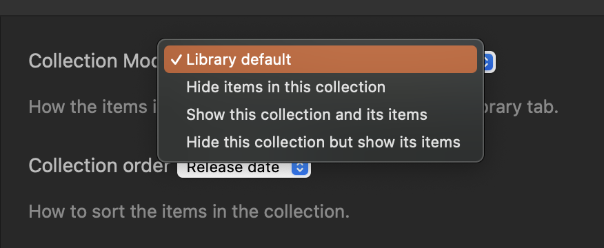
If you pick “Hide items in this collection”, when browsing a library you’d just see a single poster representing the collection. That’d make it so you didn’t see the titles in that collection but you would see a placeholder for them - one thing instead of several things. I hadn’t really thought of it but maybe a 4th option “hide this collection and its items” might be even more useful for completely hiding stuff in browse like you’d want and then you’d just go to collections (or setup home rows matching the collection) to get to those titles.
I use “Hide this collection but show its items” for Smart Collections I build for my custom Home Screen rows or for some metadata specific collections like Anime Movies or Cary Grant films or “dumb” collections like Bond Movies or Marvel Universe. That way I can get to those pretty quickly just by jumping into Collections view but don’t see them when browsing my library.
Obviously Labels would do that too because anything not shared with the user won’t show up but then you can’t navigate to it at all.
Creating smart collections for genres is pretty easy to manage, particularly for stuff based on metadata, because once you set it up the titles go in there automatically as they are added to the library. Worst case you just update the metadata when you add titles; I check metadata and artwork whenever I add any title so it’s not an extra step for me.
Neither approach is right or wrong really, just different options depending on a person’s preferences. I mostly use smart collections and filters but I use a separate library for Anime shows because it fits my environment better, so it doesn’t have to be an all or nothing thing.
I really hate the new UI; I’ve completely stopped using the android app once it was changed. Now that its on my bedroom roku, I’ve had to use it more and its infuriating. My wife usually doesn’t care much about interfaces also hate the new app. Once this UI hits my nvidia shield I’ll be checking out Jellyfin. Honestly I’ll probably look into it sooner since the plex devs and higher ups know the user base prefer the old interface but wont go back.