It just took a little while for the update to show up here. All good now.
As far as comments / observations.
It would be nice to have the ability to sort the order of our servers when we have multiple ones. In much the same way that we used to be able to drag the libraries around and pin them. I realize I can force this by the order I favorite them in but it’s not intuitive to do so.
Another observation is that for those of us with multiple servers, the Home page doesn’t show the applicable server the library is being shown for. So if we have 3 servers with a Collection “Recently Added & Unwatched” one can’t immediately tell which server it applies to. Again, granted I can rename the Collections to reflect this, but this should be a simple fix at your level rather than requiring us all to rename things to make it easier to find our own content that was clearly visible in prior versions.
And a final observation, I really dislike how the File Info no longer shows the complete path for the file.
Overall though I do like the app’s appearance. It’s a little snappier, but is definitely harder to manage quick switching to personal libraries.
Not as a defense, but just as an alternative; I’ve switched to using Plex Dash for this type of stuff as it’s more useful for me to do that than using the TV screens (also lets family keep watching while I fiddle with it). I believe Plex is coming out with a new or updated version of “Dash” to help do admin stuff outside of the regular Plex app and I won’t mind this being taken out in that situation.
It’d be useful to have that come out more in parallel though in that case.
I like the individual episode/movie screens, they are clean and the artwork is presented well
Do NOT Like:
Upon open, the active button is Home, and not the next item in Continue Watching.
Top Nav. Things should be listed Vertically, and not Horizontally
General Nav: I do not like that my libraries aren’t listed front and center. I have to click to get to them. They are also listed horizontally, and take an additional click to start looking at.
Libraries do not autopopulate when selected, they require yet another click, Can these be reordered?
Finally a left hand nav appears when I select a library, which is frustrating because that’s where I’d want selections to be the whole time
I really do miss everything being in a nice row on the left in the order that I preferred, now I have to dig for things
LiveTV: I fell in love with the combined Air and Plex channels as Favorites, I complained about this on launch, but I grew to appreciate it, and I miss it now that it’s gone
Overall:
Please take this kindly, but you really borked the overall navigational/browsing/content selection experience. This might be OK on a handheld device, but on a TV, with way more real estate it seems you’ve added layers and clicks where it used to feel more seamless.
The Roku experience as it is, is the closest thing you’ve come to the original Roku experience that existed when I started nearly 10 years ago, which was my absolute favorite. It was stripped down, no frills, left nav, easy to use. Today, the extra bits are in there, but they can be organized out of the way, and it’s just easy to use once you’ve tweaked it a bit.
This New Experience… again, doesn’t feel like it’s built with a TV in mind. I get wanting to unify the codebase, but sometimes… a vertical device needs vertical solutions, and a horizontal device needs horizontal solutions. It’s hard to imagine a one size fits all nav experience when I’m thinking about handhelds vs. tabletops.
I REALLY miss Music and Photos. That’s primarily how I play music in the house.
This reminds me heavily of that hot mess we got before Uno rolled out (top nav, categories, combined libraries)… which was also supposed to be the Plex unifying experience. Uno was… and it was better than this. I’m a pretty vocal poster when things go wrong, and if I’m not complaining, you’re probably doing a fine job. Maybe I need to be more vocal about that?
And nothing wrong with creating a better touchscreen experience - however TV and Movies are not meant to be only watched on a phone/tablet but also on a big screen so if Plex team really want to have a “unified” experience at least they should have figured out a code base for touchscreens and one for remotes
EDIT: Additional comment
Now if the aim is to say: “the future of entertainment is handheld and TV are soo boomer” then fine it makes sense to come up with this type of interface - I am not convinced that it will make Plex win paying users vs other entertainment services (e.g. netflix, etc)
It appears the internet has attempted to wipe this from memory as images of it are hard to find these days. I feel like in reality it looked much worse than this…
I like it, who am I kidding…
The UI sucks immediately, the lack of being able to access my music library also is a bad move.
My family members have had to favourite the libraries for them to show. From a registered blind users point of view, I’m seriously moving to another media server, even if I have a Lifetime pass holder,
As I’ve got patience, I’m going to ride this through and hope things improve, I’m still not happy with the Android version either, both are a mess and I’m not sure why making Plex look similar to Netflix or Amazon Prime, both I hate the layouts to.
I went to check this out after reading your post and on my system, Comcast in California, original airdate, season and episode is showing for different, but but all shows.
This night be an issue of the guide data and not the new UI.
*** Update:
I see what you are saying, this applies only to “Plex Channels” – not Live TV in general. Got it
That can easily be annoying for shows with many, multiple seasons!! – good catch.
A function that used to be in the Plex UI, removed and then told it would come back hasn’t magically reappeared in the new experience.
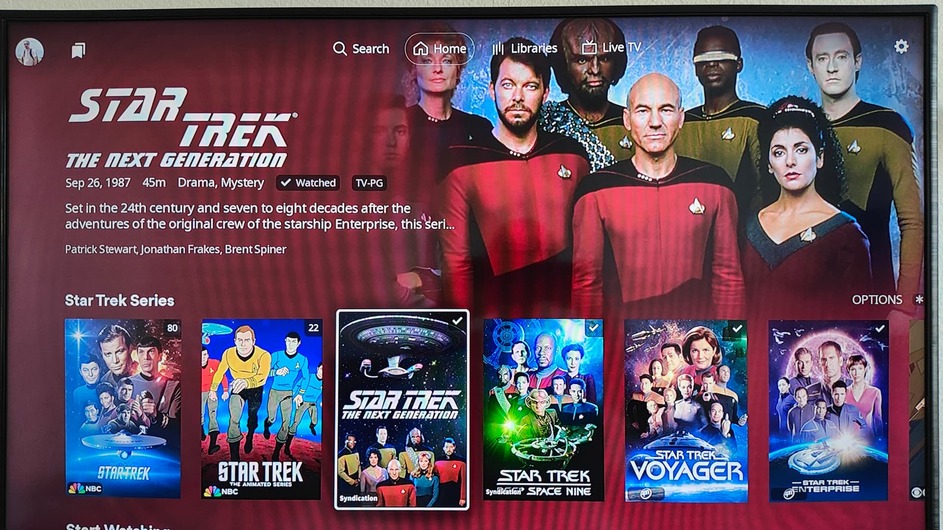
That function was showing the Studio for movies and videos under the Title.
It would really would be very helpful to have the Studio name presented again. Sometimes (very often) I want to find movies from the same Studio and would like an easy easy to reveal it on screen, or be able to click on it like I would an actor/cast member and filter only those videos from that studio.
Also, it’s it just me and my perception, or us switching between Libraries very slow to load?
I’ll want to play with it for a few days before I have any major opinions, but I do have a couple of initial thoughts…mostly aesthetics related.
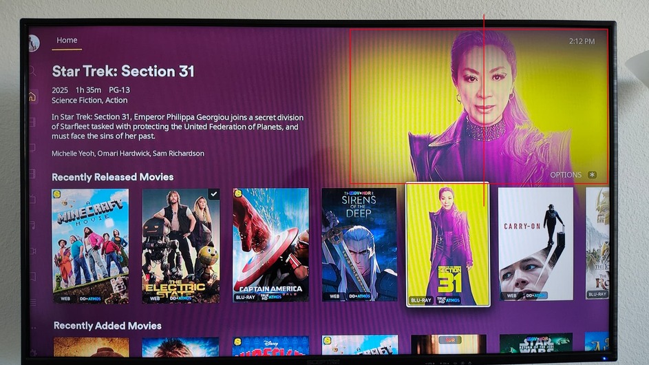
The first relates to the background images. In the past you guys cut off some of the right side to help center the image more. Now you aren’t doing that and it makes the image look offset. In these two examples, the person’s face is in the center of the original image:
Not sure if the solution is to lessen the fade on the left edge and make the image a bit smaller…but there’s got to be a happy medium.
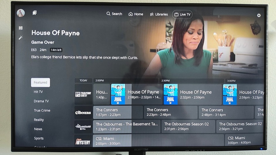
Secondly, when it comes to the channel guide, whether it is Plex channels or personal ones, why are we losing 20% of the guide? It was so much better when the lists were on top of the guide so that the guide can fill out the whole screen horizontally. This one comes off too much of a “change for the sake of change” change.
From my just recent ‘test’ - opening a library for the first time takes 5-10 seconds. After that, each library opens immediately (1 second or a fraction of).
I was able to exit Plex and “restart” Plex my using the * key option and yes, you are right, it is faster and at least on this occasion, it retained the cache and opened just as quickly as before I restarted.
From what was posted in another thread, the new Experience is only skin deep and while the Android and all iOS versions are using the same code, Roku is using it’s existing app with the new GUI.
So while they might look and operate the same, they are but the same underneath.
No longer available in the app - you’ll have to download/use Plexamp (which isn’t available on any streaming TV device, only mobile like phones and tablets).
Sad thing is that means it’s really just change for change sake. At least their reasoning for the Android and IOS apps was to use a common code platform. With Roku they’re just shuffling the chairs on the Titanic…