First: THANK YOU! The Clock is back on ALL screens and opaque all the time! It may seem like such a little thing but the “missing clock” was seriously the biggest daily use QoL detriment for me, and my household, since the New Experience beta (it’s literally like the first thing I called out in one of the first beta testing threads). It was the first thing I checked and I texted my household and they were all like “yay!” and “■■■■■■■ finally!” … got some happy campers with this change.
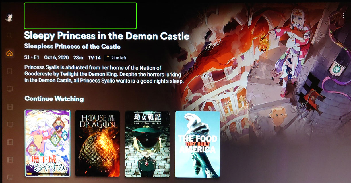
Second: I mentioned this before and with this change I would appreciate if the logos for titles - particularly for TV shows - could be adjusted to allow more height now that there’s room. See my previous post for more detail but for example:

Because TV shows have the extra episode title added to the home screen detail (compared to movies) the clearlogo gets extra squished and it looks very “blah” even when you pick wide logos instead of tall\square logos.
Additionally, that summary space is really minimal and if we could get that 3rd line back like classic had I think it’d be really beneficial.
I get that the top nav still shows up in some areas (library navigation and TV detail pages) but just wanted to revisit it as it’s even more obvious with the top navigation elements gone.
Third: The back\left navigation isn’t quit as intuitive or distinct anymore on where “back” jumps to or lands or where it overlaps with just hitting “left” or “up” in some situations so it feels like more could be done there to feel more intuitive and have fewer “oh, wups, guess that wasn’t right” clicks.
Maybe “back” on the Library page could jump to the top navigation for browse\recommend\collections before going to the left menu since hitting “left” a couple times there takes me to left menu already and that way I don’t have to hit “up” so often to get to the top nav from the middle of a library title. That might just be a preference thing as others might not expect it to work that way (lots of folks seem to forget about “Back” and never leave the d-pad control), but at the very least maybe more review of “back” and “left” controls might help make navigation a bit more efficient.
One thing I liked in the new experience vs classic interface was that the back button was more distinctly a “jump to” button which reduced hitting up or left several times to move around but in this new release it’s like “back” is sometimes just “different left” and that feels like I lost an improvement.
Fourth: I expected the submenu under the library as a pop-out still. When I clicked my Library it went to it, which is fine, but I liked having that flexibility. Knowing I could just click “OK” on the Library to jump to my default view right away or clicking through the pop-out when I wanted it felt easier for me than going to the library and then clicking a few times to move through the entire screen to get to “Collections”. Maybe a “click right” to expand the menu when wanted would be possible? It was something I appreciated having available and missed it while checking out the new app.
I setup my Plex in a way so that I rarely need to navigate away from the home screen so I wasn’t as invested in the top\side navigation issues in the past and my experience hasn’t really changed much overall with these changes. I picked up from past topics about this that my use wasn’t the typical use so these are just my personal perspectives and might not line up with more library focused navigation that is pretty popular (Emby and Jellyfin also lean into library navigation centric setups).
I am so happy to have the clock back on all the screens it’s silly but… I am so glad it finally came back. Thanks.
Edit: Oh, I also noticed the tops of posters for the next row on Home Screen are slightly visible now (my photo doesn’t capture it). It does help make it feel like there’s “more” to see and inclines folks to scroll down to see it and you can feel that you’ve reached the end better too. That was another change from Classic to New Experience I called out in beta so I definitely appreciate it.  It might be nice to have a few more pixels displayed as part of other tweaks to UI but either way I appreciate it.


 comment. Do you think this is due to lag/responsiveness and overcorrecting, fighting muscle memory, or a difference in expectation of what the back button should be doing from it’s current position?
 or accidentally triggering “exit and switch”.