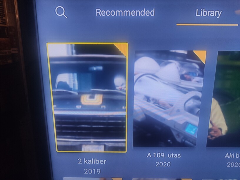
I would like to ask help about modify sub-folder names, because the text shown over the icon - not like in the main folder when the text shown under the icon - and its cause to become un-readabla whats make it annyoing when using it on TV. The main folders are okey but the sub-folders alwys show up like in the picture.
I am having the same issue. The folder names within the sub menus are impossible to read in this layout. It makes plex completely unusable for me on my TV. Something as simple as text or folder colour change should fix this. It is extremely frustrating.
I am having the same issue and this started after the last server update I installed last week.
Currently at Version 1.21.1.3830.
Prior to that, the display for folders was perfect!! Please change it back.
Same issue here! I thought this was a bug! Please fix or allow for color options! This makes folder names unreadable! I have never had this problem before but it is a huge pain!
Same here, all the subfolder views with white text is impossible to read beyond 2 feet from the tv. Please change either the view or the color of the text. Pretty please!
I have same problem with display on Firestick TV. Very bad layout. Cannot read folder names at all if name is short like “Disc 1”. Displays different with your Roku app. It is much better!
Sorry did not see this topic, I replied to a different one. There is a bug report for this but I do not have an ETA. Android team unfortunately has a large backlog of bugs they are trying to fix.
BigWheel, so glad you guys are acknowledging this!
For those of us who manage their large collections with the folder view, this is a horrible problem.
I am experiencing the same issue with my Chromecast w/ Google TV. It appears that the parent folders are fine, but as soon as you start traversing through the child folders, you get the white text on a white folder format. It would have been fine if the deeper folders just followed the same formatting where the text is underneath the folder icon. Plex, please fix this!