i noticed today that on my firecube, there’s now once more an indication of how many unwatched episodes per show, but it’s done in a new way.
there’s now two lines of text below each show poster… one indicating how long ago plex added the show to its database (which is useless information to me that wastes space and i wish i could make go away) and a second text line saying how many eps are unwatched. so the crucial information is back, but presented in a worse way than in the past.
it’s better than nothing, so i’ll take it. if the useless line about how long ago the show was added to the database could go away (it should only appear if i have things sorted by ‘date added’ imo) then things would be almost as good as they used to be, but not quite (for my tastes)
This is really inconvenient for my use case. I’m working my way through a playlist of almost 400 movies and relied on the orange unwatched dots to help me quickly scroll to the next movie on deck in the playlist. Now there’s no playlist-level watched/unwatched info at all.
Conser also that the orange unwatched triangle could be invisible for content posters with a lot of orange. The checkmark is more effective, even on posters that are black.
That’s a minor issue with the graphic design, not the logic of unwatched vs watched indicators. I’m open to tweaking the graphic of the orange unwatched indicator, but please just bring back an unwatched indicator in some way. Make it a rainbow unicorn for all I care.
It was a waste of developer resources to make the change to begin with. Since they’re clearly comfortable wasting developer time, they can give us the option.
Two years ago would you have wanted them to “tie up developer resources” changing the unwatched flags to watched flags? Sounds like yes since that is clearly your preference which you are defending rather vigorously. You just happened to come out ahead in this case.
For some of us, this is a more impactful change than any bugs that need to be fixed, so yes, I want them to “tie up developer resources” to give us an option.
Another first time forum poster here to express my dislike for the new change. Episode counts disappeared from my library. On Shield Pro. Watched indicators do nothing. Restarts/reboots etc did nothing. If it’s a bug on android, for the love of God please fix and push it to stable. Don’t want to have to install beta software for this poor decision on Plexs’ part. Working through a backlog of 400+ episodes after a 6 month hiatus and this was jarring.
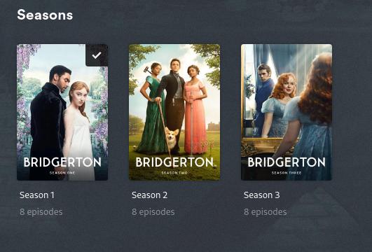
Going to come back to this again with some additional feedback I’ll stick with the Bridgerton examples I’d used above.
I’m using the web client with watch indicators set to none. So, if I go to the top level library view, filtered on unwatched and I see this …
… which lists the total episodes for the show (24) and total unwatched (10). Then at the show level I see this …
… which list the total episodes only. I know you have said its expected that there is no icon count on the poster but do you think the unwatched total will be displayed under each of the unwatched seasons, similar to the show level ?
Again, trying to be constructive but the design is inconsistent and not at all user friendly.
As there seem to be very few comments supporting the new paradigm for showing what has been watched versus unwatched, I’ll leave a quick comment here in support of it.
I like very much the recently-made changes:
For movies, showing a translucent box in the top-right of the poster with a check mark for items which have been watched.
For episodes, showing a translucent box in the top-right of the poster with a check mark for items which have been watched.
For shows and seasons, showing a translucent box in the top-right of the poster with the unwatched episode count.
For my personal libraries this results in far less clutter and cleaner looking posters on the whole. I was also never a fan of the orange unwatched wedge which, frankly, I found to be quite ugly when shown in the corner of many posters.
I’m not in any way suggesting that users who don’t like the new model should be ignored. By all means, give them an option to revert to the old design. However, the new design more closely reflects how I like to view my libraries and I’d be very disappointed if it were wholesale reverted.
I’m totally unlucky with this change, too.
I’d like to see on the “Shows” overview page how many episodes of a show are still unwatched. As it was for years!
You might add an option “Unwatched counter” with the choices “on Shows overview page”, “on a shows detail page”, “show on both” & “never”.
And I prefer an “unwatched indicator” over a “watched indicator” for the same reaons many user already have given!
Perhaps pimp the “Watched Indicators” with an additional choice of “show watched as indicator” and “show unwatched as indicator”
I’m using plex on Fire TV 4k Max stick, new generation, in app version 10.17.0.868.
What client device are you using? There’s a bug in Android TV/Fire TV clients which prevents this from showing; however, it’s been corrected in the beta releases for both (10.18.x). If you’re on Android TV/Fire TV you’ll either need to install the beta or wait for the fix to be implemented in a GA release.
[Edit]
This of course assumes you have watched indicators enabled in your account profile.
Please bring back the total unwashed count for the series. I rely on that to keep track of when a new episode on a series that I follow has been added. This new change has broken my ability to follow my workflow. You added an option great but you took away a feature. Not great
For pity’s sake. It has been mentioned multiple times in this very thread that the missing unwatched count is an Android TV/Fire TV specific bug which has already been fixed in the beta release.
It’s extremely unfortunate that this bug was introduced on what appears to be the most popular client platform for Plex viewing; or, at least, whose users are the most vocal.
The bug has been identified and fixed. Install the beta or wait for the GA release. But either way, please stop posting the same comments over and over and over and over…
it “fixes” it. the icon is still the same color (so it’s difficult to quickly glance at something to know it’s status) any the text and checkmark are the same white on black transparent background it’s very visually unintuitive.
Even if Plex did a public release right now it would still take like 2-3 weeks for 10.18 to appear on FireOS devices automatically. Amazon’s approval process is stupid slow. I just sideload any release I want.
I never suggested it would. My post was pretty clear, I think. The bug which caused missing unwatched counts on Android/Fire OS devices has been fixed in beta. Please don’t read more into my comments than is actually stated.
I personally believe that had this bug not been introduced, the outrage over this change would have been far less. As it happened however, many folks feel this was intentional and are upset with a change which was never intended (the removal of unplayed counts from shows and seasons). Every other client I’ve tested still has them and the Android beta restores them.
I’m actually okay with this black checkmark for watched items. The main reason I was in support of the orange triangle was the green check circles clashed with the overall color scheme of the interface (which is largely black and orange).
I would like the change to be consistent over the entire interface, though. Not orange unwatched triangles and episode counts on the Home page, and black ones on a library view, and changing when you go to actor pages, etc.