Hello,
With Plex app update on LG TV, version 5.61.0, it seems unseen tag is not anymore, and replaced with green seen tag.
Release note confirms it.
I hate it.
How to restore the previous behavior please ? Couldn’t find any option on the app.
Hello,
With Plex app update on LG TV, version 5.61.0, it seems unseen tag is not anymore, and replaced with green seen tag.
Release note confirms it.
I hate it.
How to restore the previous behavior please ? Couldn’t find any option on the app.
I have a Samsung, I have the same issue, the new change is a lot worse than the yellow corner for unwatched content. Should be a option on the app to make it as it was, or make it more visible.
Thanks for the feedback. I can’t make any promises but will pass along to teams
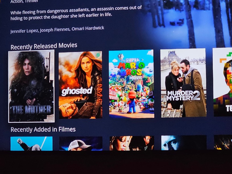
Afaict Ghosted is watched but I have been using this for a while and am used to it.
I don’t mean to say it is not hard to see for you. I don’t know if we would change back but can probably make the circle easier to see.
Again thanks for feedback I will pass it along
It would be better to include some kind of background to the green circle, imagine that the poster have some green in the upper right corner, it’s impossible to see if it’s watched or not
yeah afaik there should be a dark backgroud behind the green circle.
There is the difficulty to see the green tag as it is, but to me it’s mostly the inconsistency with the other UI.
Plex web? Unseen tag
Plex app on iOS? Unseen tag
Plex app on Windows? Unseen tag
Plex app on Smart TV? Suddenly change the behavior without giving a choice.
The nasty green tick was added to android mobile back on Oct '22 (two threads below for reference)!
I can only hope as this rolls out to more clients that more folks complain about it. It’s horrible and a step backwards compared to what we had previously.
It really looks horrible on the mobile apps. It covers a significant part of the poster, I think I demonstrated that in one of your posts @anon5074910 .
No. Here below: Horrible.
The green check with a black background makes sense to me. But definitely not without it as it is right now on LG TV.
In any case, users should be offered to choose the behavior: to display a mark for unseen or seen items.
In my case, most items are seen already on my Plex, the seen check mark won’t provide any value and already drives me nuts.
@BigWheel any chance you would consider my suggestion aka feature request just above please?
Do you agree the seen mark will provide no help to people already up to date with their libraries?
#GiveUsersTheChoice
Like I already said in my first reply I would pass feedback along which I have done and will continue to do. I am not the decider of things.
I’m not sure what this means. If you are “up to date” which I guess means you’ve seen everything I personally (aka I am not speaking for the company) do not agree because it would not matter. Everything is either a 1 or a 0 . A new unwatched individual thing would be the opposite of everything else watched.
I did find that the there was supposed to be a dark background on green check circle to make it easier to see. which has been fixed and should be released soon… and stacked media posters like season or show with multiple unwatched episodes should still have a count on them
Oh please let it be anything else apart from the ugly black squares ![]() . Maybe a black border with florescent green… Anything than those ugly black squares
. Maybe a black border with florescent green… Anything than those ugly black squares ![]()
We’ve had the yellow triangle on the corner to denote Unwatched for years, it’s in keeping with the colour theming, stands out well.
So, who decided it was a good idea to invert the logic, and make the UX awful? Green isn’t a particularly contrasting colour.
Indeed a question I was going to ask: what data sustains this change?
Where is the article explaining why suddenly deciding to change a perfectly fine and adopted feature?
#GiveUsersTheChoice
This is, to my recollection, the first thing Plex has done that I dislike. I don’t even just dislike it though, I absolutely hate it. It is incredibly difficult to see those green check marks and makes it significantly harder at a glance to see what I have watched and not watched. The orange tab that used to be there I always lauded as the best way to denote whether something was unwatched or not out of all the platforms I watch stuff on.
The design of the green check mark, the way it is, requires eye focus and active looking. While the orange tab in the prior design required only passive looking. When designing UI/UX for a system, any time you can get something working that uses your passive perception is a MASSIVE win in the UI/UX part of the industry.
Little things like this build up to an overall experience; and for something like Plex, the experience is desired to be a casual one. When you sit down and watch whatever for whatever time you have to watch. UI elements like the orange tab contribute to this casual experience and makes it a more cohesive environment. The green check marks is a step in the wrong direction for the User Interface’s User Experience and should at the very least give users the option to swap back in an options menu.
Add me to the bucket of users who dislike this change. You can’t even see the indicator unless you know what to look for. It’s extremely easy to miss.
I missed the green checkmark and thought it was a bug…
BUG: Episodes no longer being marked as new - Plex Players / Smart TVs - Plex Forum
I’m another user unhappy with the change.
The previous corner markers made it easy to spot unwatched content. The new green checkmark is hard to see and makes it much harder to differentiate unwatched content from watched content. The change is a step back in ease of use and the user experience - it has replaced something easy to spot at a glance from across the room with something that requires focused attention and careful scrutiny.