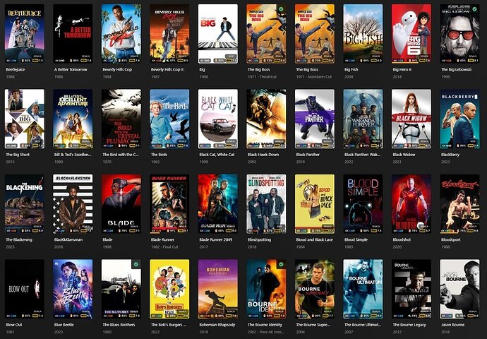
Watched Checkmark VS Unwatched Orange Corner

I have a related issue. I’ve opened my web interface to Season 5 of a series where 8 (of 15 episodes) are unwatched. But looking through the page showing thumbnails of all 15 episodes, there is no watched or unwatched indicator. Instead, I must open each individual episode to see whether the encircled checkmark is highlighted as watched.

Bizarre that one cannot view the entire season thumbnails and see the viewing status of each episode at a glance.

Depending on your client it can be inconsistent - for web it’ll depend a bit on if you’re using your local hosted web or the app.plex.tv web. It’ll either be marked as watched… or marked as unwatched… but there isn’t a specific watched AND unwatched marker. But it will be consistent in that regard.

Edit: local and Plex Web are the same now it seems… I hadn’t looked in awhile. So Plex Web should always be “marked as watched” for TV shows.

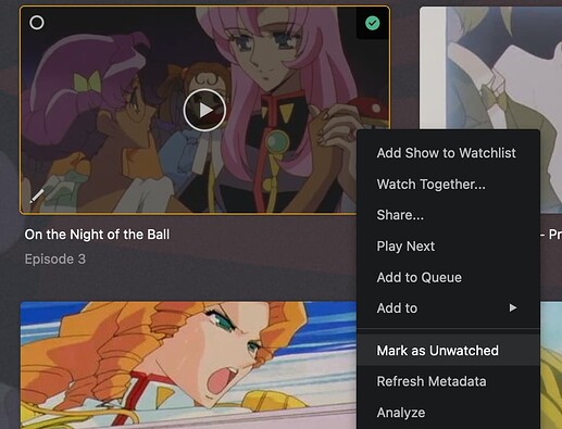
Here’s example episodes from a partially watched show for me:


Green checkboxes are watched.

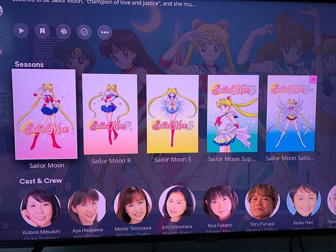
Season Level example (almost done with final season):


10 episodes left on the last season.

Personally - I like the watched mark on episodes but don’t like the “watched” on the show or season level poster (though the unwatched counter is good for me). I’d like it to be “empty” to mean it’s watched. Just personal preference. TV shows I think it does make more sense for the watched and counter to work the way it does for the most part, it’s more the movies side I wish went back to the old way of “unwatched” meant there was a marker; or give us an option to flip the logic or turn it off entirely because I like clean posters in my library and I’ve watched most of my library.

Edit: Just noticed on my Roku today that there’s ANOTHER change… it’s white checkmarks next to episode numbers now:


It seems like the transparency is higher though? Could be anecdotal for me but more transparency is better.

And on the Season display there’s no “watched” marker (again on Roku which hasn’t really been keeping up with the changes so might still be “old way”):


Which for me is the “right direction” for my preferences.

And lastly, at the show level there’s watched markers (again on Roku it’s been mostly the “old way” during these updates):

I swap between web, Roku and iOS clients so I don’t always remember which ones do things which way since it’s been inconsistent, but I prefer the current Roku way of handling watched\unwatched for TV Shows as my preference over the web-view anyways.

And agree with others that consistency would be nice.

Edit2: My triangles and episode count squares are pink because of the particular theme I picked on Roku (not sure how common an option it is).

Edit 3: Roku Preview update for 9.20.8 which I am on includes text about the watched icons; I forgot to mention I was on Plex Preview. I do like the white icons on the more transparent background in this change for episode markers.

18 months in (right?), we should probably give up the hope of getting consistency any time soon. The defaulting to not transcoding for remote clients took 10 years, and I’m not even sure that’s fixed.

iOS still has the old interface it seems, and all my other devices just have random inconsistencies. Google TV displays numbers on a yellow background when viewing seasons of a show, but if I go into a season then there’s the new interface and no matching yellow triangles.

Here’s what I see in the web interface:

One is watched; the other is unwatched. How am I to tell in this view?

This is broken.

That is not normal behavior which tells me something else is happening for you specifically. You might want to start a new thread about your watched flags not working.

To verify first though - do the other indicators show watched\unwatched?

For example, the episode menu will say watched\unwatched based on it’s status:
Watched:

Unwatched:

If those both match then something else is going on other than the indicators themselves. Either way, sounds like a bug or error it’d be useful to report in a separate thread to get fixed up for you and adding some of those details will help.

At the risk of this thread ever going inactive, let me add my voice to the chorus to say that:
(1) I prefer an “unwatched” marker over a “watched” marker
(2) the black background of the green-check watched marker is visually jarring on my screen of carefully created posters
(3) I would very much like a setting to choose how this works (including no marker of either kind)

5 Likes

Yep to add my voice to this.

Green ticks are horrid, ruin posters.

Seeing what is “new” and unwatched is definitely preferable than something watched.

Just saw a deal to buy lifetime membership came back here to check to see if this had been fixed as I’m currently happily running an older version of server and didn’t want to invest if this was still not resolved. Guess I got my answer, which is a shame for an unneeded UI change.

2 Likes

I just discovered that the green “watched” checkmark seems to only exist on the Web Client. The latest Android version, whether on mobile or TV, as well as on Apple devices, does not have this green “watched” checkmark. It appears that only the Web Client, meaning the web and desktop versions, have this green “watched” checkmark. Please revert this change.

It’s there, just not consistently throughout the apps, as highlighted in above posts.

I see, I don’t have an Android mobile device, only an Android TV. Because I didn’t want to see the green “watched” checkmark, I kept my Android TV client version at 9.26. Yesterday, a friend told me that the latest version of the Android TV client doesn’t have the green “watched” checkmark. His mobile client also doesn’t have the green “watched” checkmark in his library, but it has episode badges with black numbers instead of orange ones, which seems different from yours as well.


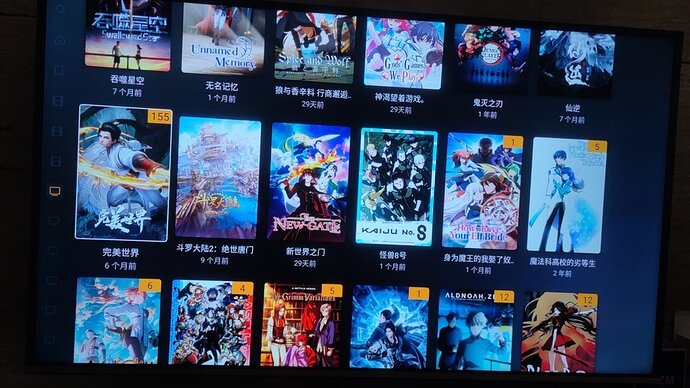
I have upgraded my Android TV Plex to version 10.14. I now understand what you mean. The styles of the home page and the library page are different. The home page has the green “watched” checkmark and episode count with a black background, while the library page has triangular unwatched corner and episode count with an orange background. This is simply terrible, even worse than before. I can’t believe this is how Plex looks now. An app can’t even maintain a consistent style, not across systems, but within the same app. It’s unbelievable.

It’s not just the corner that are different, even the poster sizes are inconsistent. The green “watched” checkmark and the episode count with a black background are also not in harmony. It’s terrible.

2 Likes

Love the green checkmark, much more low key than the giant orange triangle being placed on all newly added content. Think about every service out there: D+, Netflix, Hulu etc. Not one of them marks unwatched content.

Plex likely has data that shows most people have more unwatched than watched content in their libraries. Given that the green triangle (marking watched) status makes even more sense. Less markup needed.

Doubly so for large libraries. I’m hosting 260Tb for friends and family, and the vast majority of my collection is unwatched. Orange triangles polluting the interface everywhere and cutting off posters.

Anyway this is user selectable in PM4K so if this is that big a deal to you, just use PM4K and toggle what you like.

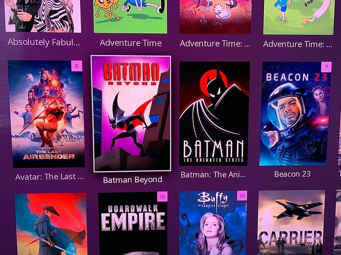
I know what I prefer, the first is much cleaner:

vs the messy looking:

So much less markup

2 Likes

I curate my library with local content I’ve chosen - not random stuff - so I know the content in my library from the start. This is why I want unwatched to make sure I catch things I’ve added but hadn’t gotten around to watching yet - I have smart collections to bubble up things into hubs to help reduce decision fatigue when wanting to pick something to watch.
Or have it off entirely because again, I know what I added. I’ve also watched almost all of my content because I put it there for me to watch it so I definitely have checkmarks covering my posters more than there are unadorned posters with this change.

I also think the green checkmark covers more of the poster art than the triangle did and ends up covering titles.

Services like Netflix are broad libraries which is why it makes sense for them to mark watched content vs unwatched. Plex is moving towards a service as well which is why earlier posts surmised they might be making this switch. If you manage a library similarly - particularly with lots of friends\family connecting to it - that makes sense too.

A side issue is that it’s inconsistent across clients too. No matter which option is being used it’d be good for it to be consistent.

I do think there isn’t a right or wrong answer which is why, personally, I really like the idea of setting an account level option for watched\unwatched\off (see some earlier posts in this thread). For me it’s more about the movie library than the TV library because I think they are a little different so that probably would add to complexity a bit in providing an option but since watched\unwatched is already processed, adding logic at an account and\or library type level seems feasible.

3 Likes

Plex privacy policy clearly states that they don’t know what is on our servers. So this is not true either.

The vast majority of my libraries are watched. Thus ruining a great poster layout does zero good.

1 Like

And for those of us where the vast majority of our libraries is watched, because we tend to watch them as we add content, we end up with the Green Crap Mark that takes up more space on the Poster than the Yellow Triangle does.

If we have to have a Marked indicator I would prefer something like the YouTube one where they add a red bar based on progress watched and leave it there as a Full red bar when done. Plex already has this for partially watched having a Yellow bar added to the bottom of the posters, not covering the poster, just leave the Yellow Bar in full for watched.

But as I have indicated earlier in the thread, I would prefer some method of Customisation so that people that want Watched can have it, people that want Un-Watched can have it, and people that don’t want anything can turn it off.

3 Likes

One of the few user cases where you have a huge library of unwatched content is where you are… Well you know…

1 Like

You should compare the TV show library. In previous versions, there were no marks on the posters of the shows you had already watched. Now, all the posters in the TV show library have marks.

I think that was Hoarders S05E07

1 Like

Has anyone found a way to revert this yet?

I’ve been using the old server version with direct IP to keep the Orange and reject the Green. However a plugin I use in my browser to sync the Anime that I have watched with MAL has stopped working with the old version via Direct IP and only appears to work with the new version via app.plex.tv.

So I’m once again looking for options to get the Orange back.

I did come across a couple of reddit posts for using extensions/CSS overrides to block/hide the object if you just want to hide the Green, but nothing to put the Orange back. So for users that just want to hide the Green, this may be an option for you.

1 Like