Server Version#:Version 1.19.4.2935
Player Version#:Version 4.29.2
Plex as completely RUINED the layout for music albums in the music section!!! I have folders I’ve created with hundreds of albums and now you have to slide from right to left to see the albums in the folder instead of seeing them all?!!? THIS IS HORRIBLE!!! I might rip out Plex because of this. My music library is extremely important to me as I use the app for music every day. and now you’ve ruined it!!!
I HIGHLY suggest you make an update to change the layout back or make it easier for users to see all the albums in the folders and not have to slide.
Yes I’m not happy about the update and the new layout, because I work from home and I use the music part of Plex every day.
I open up the Plex app on my Android phone, select “music” from the menu and I see all my artists/folders listed the way I want them.
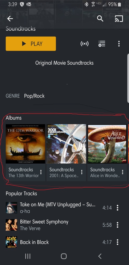
Now when you go into the artist/folder and lets say one is called Soundtracks and you have over 100 albums instead of seeing a full page of alubms now you see 1 row and you have to slide from right to left to see the albums. This is very counterproductive when you have a lot of albums in a folder. and have to slide instead of the wall of albums like prior.
There’s no way to change the view or anything, I’ve been looking and this layout is from the very recent update I received.
Ok… so you have an “artist” that groups all your soundtrack albums.
If you want to see all albums… just click on the section header (Albums).
That’s at least working on iOS.
The actual “hub” on showing on the artist page is supposed to show as a summary.
I completely agree! This new layout (horizontal scroll) makes no sense at all. It is the same behaviour in movies ant shows!
Why did that change in an app that is made for vertical content scrolling? Who thought about this??? It is ridiculous. Change it back to what it was or at least make it optional.
Gee, Plex is getting worse
No I want it back the way it was before this update with this horizontal view. The layout and the way the music was prior to the update was 100% fine. Now it sucks!
That’s correct. There’s no way to change the layout.
That being said. Click on Albums right on top of the “The 13th Warrior” cover. This should give you list of all soundtrack albums in all their vertical scrolling glory.
On the whole I am happy with the new system but I completely agree with Tenyrsgone27. When viewing by artist with more than 10 albums or so makes this completely frustrating to use.
If viewing AC/DC / Rolling Stones or similar with a large catalogue, I have to scroll continuously to find the album/EP I want. Similarly I have a artist called “Various Artists” to cover compilation albums etc. that has many albums in which is now impractical to view.
Please provide an option to view list/grid when viewing an Artist content.
(Plex Android app 8.2.0.18057)
Please change it back! I have some artists & soundtracks with hundreds of albums. It looked & worked beautifully before, now to scroll to an album, it takes months! It’s horrible & personally makes Plex no longer useable.
I agree with this feedback. Use cases where this is a problem include:
Artists with large catalogs
People who use tags such as “Various Artists,” “Compilations” and “Soundtracks” to group those types of albums
Classical listeners who use the “Album Artist” tag for the composer where an entire album is devoted to works by a single composer (e.g., I have 49 albums with “Ludwig van Beethoven” as the album artist)