I wouldn’t say a monthly subscription, but I’d gladly buy another lifetime license, but they have to remove some of the enshittification as a result and keep the left navigation UI. Or maybe a X-year license where I’ll buy it again periodically as long as the term is communicated up front and I keep rights to older versions of the software.
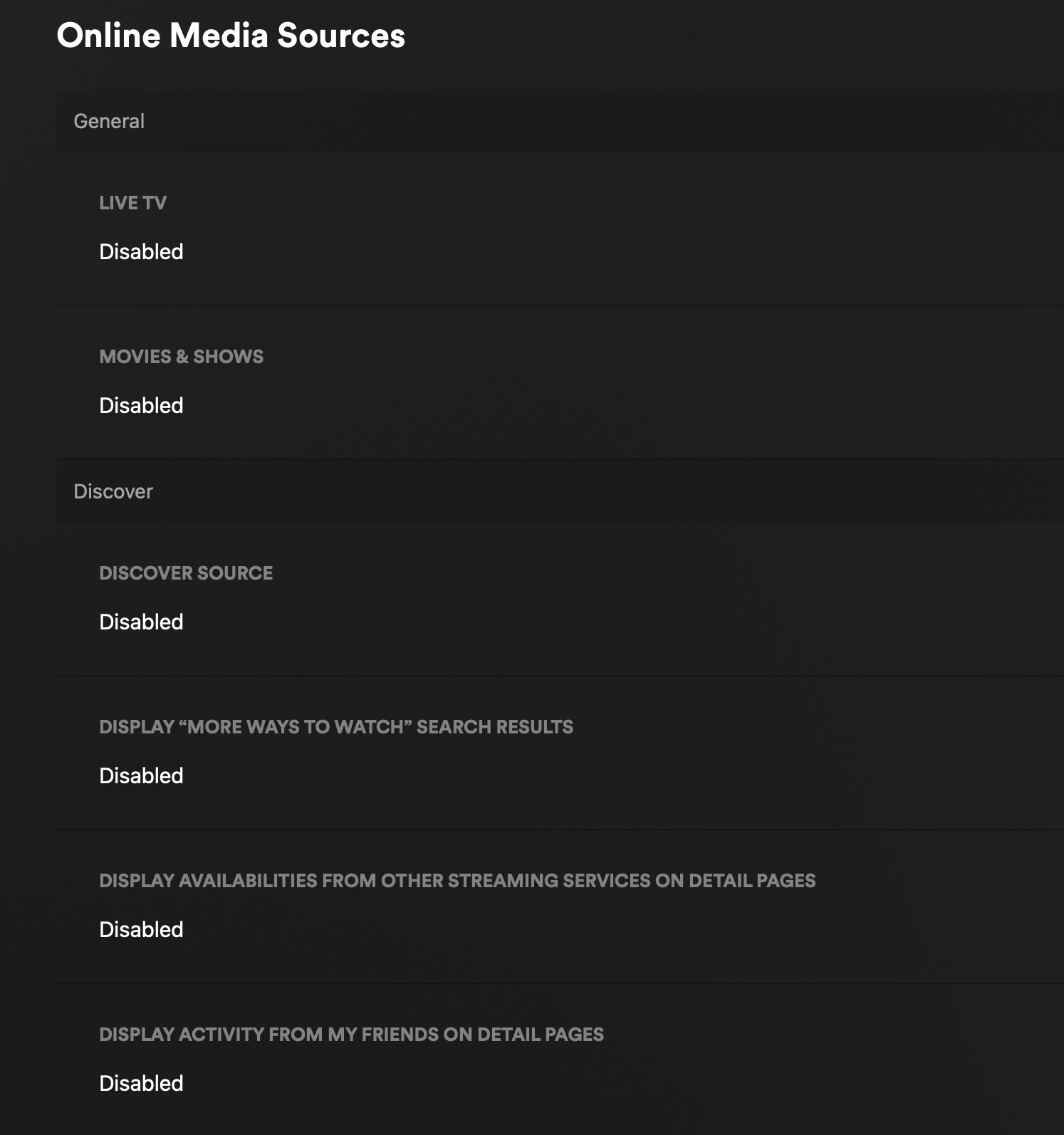
Plex still has settings to remove all(?) of the enshittification. On the new UI all I see in [Home] is [Continue Watching], [Recently Added] and my OTA Channels. I quickly got used to the New UI, and for the most part, I usually just select a [Continue Watching] show, I don’t even need the Menu (and when I do, the Top Menu is fine for me).
Almost all streamers moved to a Top Menu (and the ones that haven’t, i.e. Hulu, probably will), so I’m fine with it (the back key is your friend).
My only issue with Plex is privacy (though I selected all of the opt-outs, I really don’t trust them) and the need for Plex to Call Home to use. This is where Emby/Jellyfin have the advantage, but every time I test them (Emby last month) I aways come back to Plex.
As long as Plex keeps these settings available, I’m happy.
I am absolutely open to options. If they’re looking for sources of revenue, I’d rather it come from people who are interested in the original spirit of Plex, rather than those who are perhaps not.
I gotta say the new UI is just not as easy as it used to be. I have a version of Plex HTPC setup on my laptop that I use and its using the old UI and its so much more simple and customizable where you can place your libraries in order right where you want them and hide all the stuff you don’t want to see. This is especially useful for children profiles to give them access to only one library that’s easy to navigate without all the noise. Not sure if you have access to older versions of the roku app internally but maybe install plex HTPC on a windows device and give it a go if you want to see what real customizability looks like. There really is alot of history of trying to make the top navigation work over the years and it always goes back to the vertical option. A quick google search online shows many studies where vertical navigation is faster when you are visually navigating sites.
Studies show vertical navigation is generally faster for users to scan and find items, especially for a large number of options, and scales more easily than horizontal navigation.
Vertical navigation
Faster scanning: Eye-tracking studies and psycholinguistics indicate that users can scan vertical lists more efficiently than horizontal ones, resulting in fewer eye fixations to find an item.
Scalability: Vertical navigation handles a large number of top-level categories better and makes it easier to add new items without disrupting the existing structure.
More space: This is beneficial on wide-screen monitors, which are now standard, as it can keep the navigation visible without taking up excessive horizontal space.
Better for deep hierarchies: It can accommodate more levels of hierarchy compared to horizontal menus.
Ease of use: Users often find vertical menus easier to hunt through, making them better for a “to-do list” style organization
Heck even try changing your browser to use vertical Tabs over the horizontal tabs. I promise you will never go back. Its so much easier to find a tab when its in a vertical list.
I noticed that the description of an episode does not show up on the right thumbnail, sometimes it lags behind multiple episodes if you scroll even at a slow pace.
The fact you can create a Plex server and fill it with your own content from discs you bought. Also you can watch streaming video content and rentals legally offered by Plex. The apps Amazon is cracking down on are not those types of apps. They are apps that connect to specific third-party services to play back unlicensed content from them. There is no legitimate usage for those apps like there is with Plex and Jellyfin.
That’s fixed in a recent v9 release - was a complaint of mine too and noticed it had a fix and does seem to be working better now. Maybe give that a try and see if it’s better.
Well… nuts. It seems much better so was hoping that lag issue was totally gone. I was pretty sure it was that cast loading at the same time initially so seeing them loading separately now I thought that did it and didn’t really test it more…
The Home Screen loads summaries fast and without lag so it’s gotta be something with the extra stuff loading on that detail screen then.
And to my point of the question we already know the answer to…..this is what makes Plex legit and brings revenue, but is what lots of people complain and don’t want to see.
Then they can just turn it off in their account settings.
Fun fact: the ability to disable the ad-supported content has been around longer than the new interface.
Edit:
I’m not sure what point you’re trying to make with all this. I’m not married to Plex like some passive-aggressive spouse. If they piss away their lead over the competition in the client UI category by enshittifying their app to promote the ad-supported services, I’ll just do something else. I have a Jellyfin server already operating, with remote access, right now. But I don’t even watch videos on my cell phone to start with and I don’t need a media server in my own home where I can just set up an HTPC with access to the local file server.
You asked what made Plex a legitimate app and not a pirate app, a not-subtle attempt to spread FUD that Amazon was going to remove the Plex client app at some point. I guess you didn’t consider that the “pirate apps” Amazon is targeting wouldn’t have been allowed on the app store to start with, they have to be side loaded.
Yeah like we don’t know what’s going on here. It’s about making ‘discover’ front and center - otherwise it would properly migrate your settings. Just glad there’s plenty of other choices now.
Sorry you feel that way, I don’t own a Roku and I have been happy with my New Experience via Testflight for ATV was my point. So I don’t understand why your dragging me into your mindset.