Server Version#: Version 1.20.4.3517
Player Version#: PlexWeb Version 4.43.4
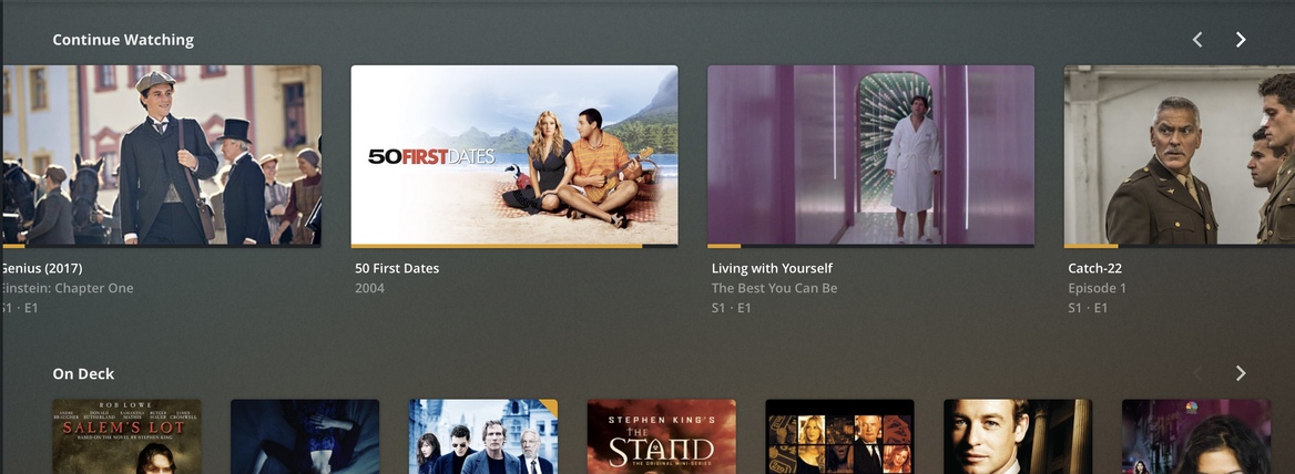
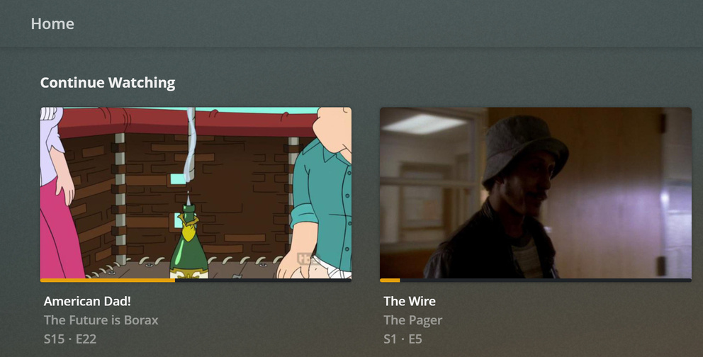
Thumbnails for TV items in the Continue Watching hub are once again back to showing episode thumbnails instead of the series thumbnails.
Just in case this is intentional I will explain why this is a bad idea. If you have older shows thumbnail selection for episodes is often very, very bad. Often poor quality and sometimes not even of the right episode. Where as getting a series thumbnail is much easier and it works for all episodes.
I really hope this isn’t yet another move by Plex that is being made to benefit their desire to be a media streaming service, that breaks stuff for long time users (ex. The “new and improved movie agent”)
EDIT - This is not a solution merrily a workaround I posted at the bottom of this thread that everyone should be aware of…
"Edit - If you turn off “Automatic Home Screen Management” (which you should anyways because it fixes a host of other issues, some of which are mentioned here: Manage Home Screen Automatic & Manual) you will get the old, correct behaviour. This is unique to PlexWeb for this specivic issue (old, correct behaviour exits on other platforms with Auto Homescreen Management on or off) but its worth turning off on other platforms for fixes to other issues.
It’s extremely troubling that you’ve introduced all these player-side visual customization features which, because they are broken, end up causing incredible amounts of hassles for admins."
Please allow us at the server level to keep it as is and please do not bring this to other platforms. (This is not how it works on iOS or tvOS and the times it’s been changed on those platforms it has been reverted back)
Again, episode thumbnails are often terrible quality (especially for shows older than say 2010) and often have very little to do with the subject of the episode. You aren’t getting any clarity as a user from that. No one is remember an episode off a single screen grab.
The suggestion to “just change it” isn’t feasible for people with medium to large libraries. For older shows with multiple seasons at 24 episodes a season, that’s a colossal undertaking. I hope Plex cares enough about its customers to not simply dismiss this concern out of hand.
The reality is Continue Watching for a TV show is there to remind you you’re in the middle of watching an episode of a specific show. You are never going to have multiple episodes form the same show up there, so there is no need to differentiate between episodes in this way.
Beyond usability, it makes the Plex UI look awful. See attached images…
I believe the idea with using the background is that it then also allows that if you have the BIF generated for that episode, Plex can use the actual BIF image so it will show exactly where you are in the file, and not just a random screenshot.
And if the user doesn’t have thumbnail generation on? Which is true for a lot of people due to space considerations.
Also, I don’t understand why this is helpful. I mean it’s cool the devs can do this, but if I click play it brings me to that point. Why do I need to see that in the UI beforehand? You’re more likely to pause something during an unimportant part of an episode, so I can’t imagine many of these would be representative of anything other than a lull in the episode.
More importantly the screenshots I posted include episode that have thumbnails generated and are still showing downloaded thumbnails. So if this is a “feature” it isn’t working correctly.
If this isn’t a bug (again, this has been treated as a bug on other platforms in the past) I really hope this doesn’t change for movies as well.
I’m not aware of any streaming platform that does this because understandably they don’t want their UI to look awful.
If this is the way forward for Plex please allow this as an option at the server level.
I too would like to have the option to disable this. I just think it looks bad and is making it harder for me to see what episode it is. When seeing the show image I know what show it is instantly. When I see a generated thumbnail of the episode, it takes me a while to understand what show it actually is. Please allow us the option to choose. Thank you.
This has just happened to my server for On Deck, it looks absolutely horrible.
How do I change it back to displaying the art for the series instead.
This is not a good change Plex
This bug still hasn’t been fixed. No other platform besides the web-app does this. You’re two biggest platforms (iOS/iPadOS/tvOS and Android/AndroidTV) look much better because they use the series fan art.
Anyone with a show older than 5 years knows that episode art is generally awful and has no real informative value as to what show or episode it is. It would be better from a navigation standpoint that the huge Continue Watching artwork was actually informative.
Why the web-app developer has decided to diverge from the rest of Plex apps is bewildering because it’s made the experience of using the web-app worse, not better.
Edit - If you turn off “Automatic Home Screen Management” (which you should anyways because it fixes a host of other issues, some of which are mentioned here: Manage Home Screen Automatic & Manual) you will get the old, correct behaviour. This is unique to PlexWeb for this specivic issue (old, correct behaviour exits on other platforms with Auto Homescreen Management on or off) but its worth turning off on other platforms for fixes to other issues.
It’s extremely troubling that you’ve introduced all these player-side visual customization features which, because they are broken, end up causing incredible amounts of hassles for admins.