I really hope that this smaller font weight is a bug? Making it smaller has decreased the readability and looks kinda out of place in relevance to the rest of the elements on screen..
Old:

New:
I really hope that this smaller font weight is a bug? Making it smaller has decreased the readability and looks kinda out of place in relevance to the rest of the elements on screen..
Old:
New:
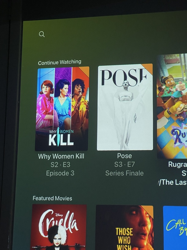
I would have rather seen a smaller font size for the row item labels. So much text on screen. At least make the second and third text label rows smaller.
While personally I don’t disagree, I do have to bring up the issue of accessibility. As it stands, the current size is pretty well balanced, anything smaller may pose a problem for some people. If anything, we desperately need an option to customise the size like you can on the web app.
I got news for ya,
That ship has sailed.
I remember when the only thing on the coffee table was a remote or two:
This topic was automatically closed 90 days after the last reply. New replies are no longer allowed.