Still - why having to go through library button in the first place to see my two libraries?
Before could see them immediately on the Hamburger menu.
Still - why having to go through library button in the first place to see my two libraries?
Before could see them immediately on the Hamburger menu.
why cant I sort by play count anymore?
this new app sucks
What’s the practical difference between having to tap on the hamburger menu to display your library list vs. tapping on the Library button to see your library list? The latter doesn’t seem to require any more effort than the former.
My recollection of the old app was you had to click the hamburger menu to open it and then select the library. So it was still 2 clicks to get to a library.
The press and hold method to bring up the libraries is borrowed behavior from the PlexAmp app. Granted, it makes more sense in PlexAmp, but now that it’s been implemented into the regular Plex app, it’s function and purpose just don’t seem to fit as the right solution. What works as a proper solution for one type of media might not be functional for another and that’s where and why I think it was getting harder for Plex Inc. to keep working on a all-in-one app solution for media, at least for the goals they also wanted to achieve with their venture cap special interests involved.
On iPadOS you only needed one tap, it was all on the left.
… and before the user had s choice if they wanted to see the menu or hide it. Now its always there snd clutters up screen; and that new bottom menu is less granular than the hamburger menu that showed the library items directly.
So no: new functionality is worse; clutters screen and key libraries cant be selected with 1 click (compared to before when users could directly switch if menu was displayed)
I can select my libraries with 1 click after opening the app. So out of curiosity do you have multiple TV and Movie libraries? Instead of just 1 Movie and 1 TV library?
Although it’s a bit of a mute point when pretty much every other function hangs or crashed the app.
Like even watching a recorded item
Id be sacked in an instant if I released this. It would be a full restore to the previous version, and never got to full rollout in the first place.
Just because something has a large array of features that actually provide functional value to users does not mean it is bloatware. Going all berserker mode on a robust set of features just to make it smaller doesn’t make it better. But yeah let’s just burn it all down and see what’s left working in the rubble amongst the architectural ruins of what was once a great product.
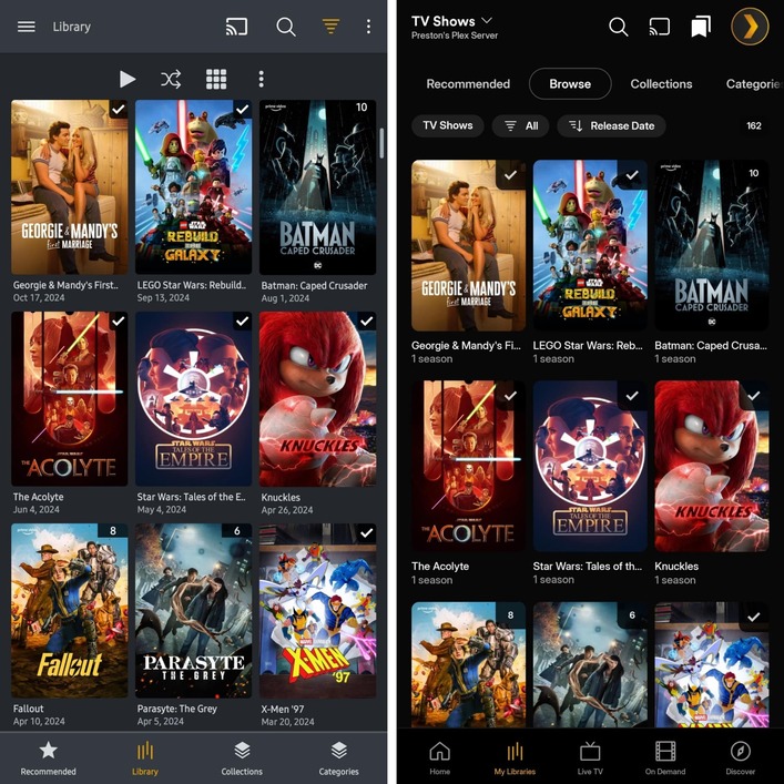
Old behavior:
New behavior:
How is this an improvement?!
You can argue I‘m too detail oriented; but if the goal of this redesign was to make it more userfriendly and the result is more clicks and less functionality: sorry, failed!
I have movies & tvshows.
So 2.
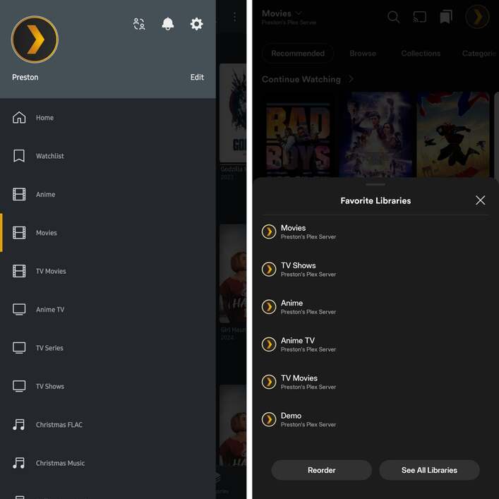
They are floating as chips on the home screen and yes: from there you can select with 1 click.
I find it weird that there are 3 places you can chose the target library:
Feels clunky.
If you insist on having that bottom menu; why not simply give the possibility to pin certain libraries there (like you had in hamburger menu before)
All the rest you then dont need..
I give you the point that the bar was there before: I simply never noticed it because I found all Features on that bar useless.
Why I notice the bar now is because these feaures have now been moved up („recommended“, „browse“ etc) for which the bar covers the titles of the movies in the 3rd row.
So can we just agree that the new way of getting to libraries is no quicker or ‘clutter-y’ than the old way? Seems there’s actual real issues which it would be better for Plex to focus on.
No. I stand by my point that the old way was better.
there was one single menu for navigation (hamburger), and one single click brought you from movies to tvshows and back
Now there are three ways to navigate (which is not better but just confusing) and to switch between libraries it now takes you two clicks compared to one before.
Lastly, while i admit the bottom bar was there before, functionality from that bottom bar was moved out of it and now consumes additional real estate.
Yes, I agree with you; looking at the bugs other people report plex has more important bugs to fix. But i do not agree that the new design is better. It‘s worse in my eyes.
Well it didn’t, unless you did absolutely nothing else in the app and just sat looking at the menu.
Up until you scroll down, which you would’ve done anyway if you were watching anything beyond the 3rd row.
I dont think I‘ll ever convince you of bringing the burger back.
What would already make me happy is the possibility to pin my libraries to the bottom menu so i can simply navigate between them. Analogous to how we were able to pin libraries to the hamburger menu before.
In the new app, currently my bottom menu has those entries:
Instead of library button (that opens menu that allows me to chose a library), i‘d want to pin tv shows & movies directly.
I brought this up before this version was forced on us and this was said by Plex:
It may still happen, but they were aware this was a complaint long ago.