Is the manged hubs enabled in the new beta if so where is it? I am trying to tweak the home sidebar menu to have my recently released and add movies only show up?
Otherwise the new app is looking good, great work Plex team!
Is the manged hubs enabled in the new beta if so where is it? I am trying to tweak the home sidebar menu to have my recently released and add movies only show up?
Otherwise the new app is looking good, great work Plex team!
@sLumpy
Live plays fine now without having to disable Direct Play.
Channel order in the guide is just a random mess each time.
Feedback Sounds turned off but still plays a sound.
Hy.
I have a Samsung 43TU8002 TV.
I am still not seeing this early access tab on my plex.
I know that it will be realesed later but does someone know when?
Thanks for the help.
Is the manged hubs enabled in the new beta if so where is it?
Managed hubs is currently not available. I believe some decisions are still being made around managed hubs.
Channel order in the guide is just a random mess each time.
Feedback Sounds turned off but still plays a sound.
These are fixed for the next preview release
I have a Samsung 43TU8002 TV.
I am still not seeing this early access tab on my plex.
The 2020 devices are still awaiting Samsung to release 4.29.7 so that early access will be available.
Not surprisingly, the bugs reported here and here get worse.
In this version, the subtitles not only stopped to be shown near the end of the video, but now you can’t make them reappear by rewinding some seconds. You need to go to the settings and come back again to see the subtitles.
Oh my…
Yeah I must admit, after using the new player more, I do much prefer the old UI of the player. So much simpler and cleaner. Everything else is a step up, but the player UI feels like a step back.
Yep, same here.
I have disabled direct stream, exited app, started again, no Live TV play… Did the same for direct play. No live TV.
Yes!!! A live TV guide!! Woot woot!! Thank you so much for adding this, starting to look and feel like a solid streaming platform. I love it.
Trying to look into the blurryness you’ve all reported, but I can’t reproduce and I don’t see a noticeable difference from the old app. Can you provide pictures of the blurryness compared to the current production app? Feel free to DM it to me if you don’t want it publicly shared. Please also include your TV model.
@zamana Unfortunately, those issues are due to the way subs are streamed in so that we can keep direct playing. I’ll see what we can do to improve the streaming side. I’ve logged an internal issue to track this.
@redairforce Can you send me some logs? You’ll need to enable log to server in Settings first.
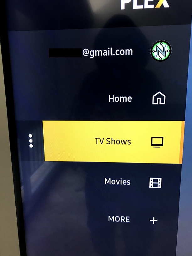
I guess it’s kinda nit picky, but for me the new letters look blurrier in the new one, but it’s something that I can live with. Look at the @gmail.com and the 3 vertical Dots, that’s where I most see it.
But again, I would much rather have a smaller, more useful playback UI than a change to this.
I am enjoying the new screensaver!! Looks really good with movie and TV show backgrounds! Much better than “PLEX” bouncing around on my screen.
Dear @sLumpy,
Thank you very much for the feedback. That’s best one I had in months (no jokes; no kidding).
It must be something related with time, because this always happens at the very end of each video. If you consider that the whole .srt file was played nice for, let’s say, 98% of the time, it does not seem something related with the subtitle file/content per se.
Thanks and count with me if you need tests or logs or whatever.
Regards.
Same on the feedback sounds here. Had to enable and then disable and they seem to be gone now.
I disabled Direct Stream and…
Issue 2: it certainly seems to be more reliable, but I still see “Live TV playback could not be started” about 3 out of 10 times now. I’ve not figured out whether it is certain channels that seem to be more prone to this now or not - but I will test more over the coming days.
Issue 3: Still the same for those channels. Found some more as well.
Issue 4: Fixed - not sure why direct streaming would cause the resolution to be squashed and transcoding it would display correctly at 16 x 9.
I’ve gone off the beta and back to the ‘current’ release channel, reason being I’m watching The Untamed and as mentioned previously the subtitle options in the new version need some work (colour options as well as size).
Also skip intro is awesome but can we have the ‘buffering’ sign up for that couple of seconds please? The Untamed is a 2 min intro right at the start so you load the episode and you skip intro but it just looks like it’s frozen as the player buffers ahead.
Also I prefer the old season layout when selecting my episodes from dock. Thing is I like putting my ‘current’ episode front and center, I like that in the new interface when you scroll it auto selects the highlighted episode but I’d prefer scrolling down to the scroll bar to get there rather than putting that front and center because odds are I’m going to watch my episodes in order anyway.
Also will they be adding in watch party functionality or is that only in ‘selected’ clients for now?
Just wondering if I’m missing it, but on the new UI, I can’t figure out how to skip chapters in a movie.
I used to just hit the select button and the chapters would pop up at the bottom of the screen.
Now I can’t figure out how to do that.
sLumpy,
Thanks for keeping us up to date!
I noticed I can press the play button to play from menus now, that’s awesome and I honestly wasn’t hopeful it would make it in. So thanks to you and the dev team!
I’d just like to double (triple?) down on my dislike the the current UI. Other people have said it better than I have so I’ll just parrot them: The current UI is too large, it’s like turning windows scaling up too high.
The player control bar pops up too high and is rather intrusive.
Subtitles are also not quite right. It’s like they are missing the shadow or outline.
Also still missing thumbnails while scrubbing, I didn’t notice if you had already acknowledged that, sorry if you had.
Cheers!
100% agree, its such a waste of space as it is right now.
If you only keep one thing from the old UI, keep the now playing bar. ![]()
hi switched to this build a few days ago, noticed a few small issues
other than that I like the new interface.
Thanks
I have just noticed that autoplay now stops after a few episodes rather than carrying on till it was stopped. Is this staying this way?