It’s odd that it appears after a Mouseover, yet functional
I imagine it is done in an effort to have a ‘clean’ ui with minimal duplication, however I really dislike UX that hides or obscures functions behind mouseovers and overflow menus (3 dot menus).
Reason:
So I have to struggle to keep it open long enough to be able to use it.
Just like every other Cascading Click Wall Plex appears to be really in love with…
The New Plex is NOT designed for Old Users - that much is certain:

Can hardly land on the 3 dots to open the next one…
Fall off several times trying to open yet another one - and have to start over…
… and guess where Empty Trash is…
that’s right, Folks - the cheese is at the END of the Maze, not at the Beginning.
Bonus Round:
Guess what’s missing from The Old Folks Home - where buttons are almost big enough to hit:

The Kebab and Meatball menus, there everywhere nowdays
Especially bad when it isn’t cramped for space in the slightest.
In this particular view the Libraries are alphabetical and the order here doesn’t affect the client view at all. The sortable parts are the hubs within each library. The order of those do reflect in the client screens.
Hitting like button now
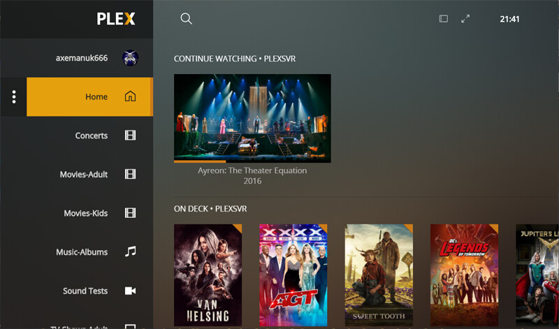
@DaveBinM - Please consider this as an option! Merging On Deck/Continue Watching doesn’t work for everyone. Take this screenshot as an example - the only reason you can even see so many options is because I am on my PC with an ultra-wide monitor - normally I am on a 1080P TV with a Roku, or a 1080P monitor with Plex for Windows.

In the screenshot above you can see a HOST of media that is “in progress” - ie: paused.
The problem with this is that certain in progress media takes precedence over “On Deck” episodes.
A perfect example of this is “RuPaul’s Drag Race Down Under.” My SO & I watch this every week.
RuPaul’s Drag Race Down Under S1E8 was added on 6/19 at 0230. That is less than 12 hours ago! Yet it is behind 8 different other things in the Continue Watching row. Including a movie that I started and stopped on 6/16 (HP #6.) The last time I watched Harley Quinn & Adventure Time was on 6/17, so as far as I’m concerned, RuPaul’s Drag Race Down Under should ALSO be in front of these. The same is true for How I Met Your Mother and Parks and Recreation (both started & stopped on 6/18.) The Mindy Project & The Internship were both started this morning(6/19), after RuPaul’s Drag Race Down Under was added, so those are “OK” in terms of their placement, but do you see how this change simply does NOT work for all use cases? Please for the love of God, make this option toggle-able.
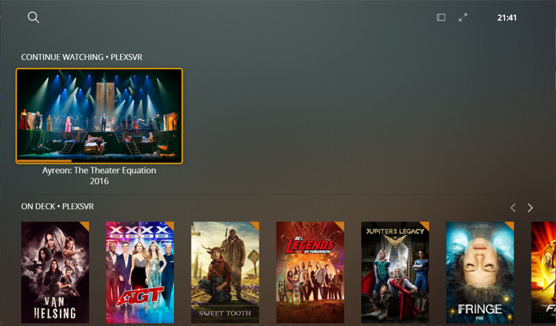
Again, as I mentioned, I can only see this many items because I’m on an ultra-wide monitor. This is what it looks like on a 1080P monitor - I can’t even see any new items because there are so many things in the Continue Watching row before my newly added TV episode that is “On Deck.”

EDIT 2: Ironically, I see even FEWER items on my 55" TV via the Roku app, than I do on my 23" monitor via Plex for Windows. ![]() I can see 8 items on Plex for Windows, while I can only see 6 on the Roku app.
I can see 8 items on Plex for Windows, while I can only see 6 on the Roku app.
Thanks @Pow4Life181. This for me has to be the single best example and explanation of why the merging of CW and OD just just doesn’t work - Or at least doesn’t work for everyone!
I have been in this position a few times in the last few months, where I had several unfinished movies on the go, and before I knew it, none of my OD episodes appeared when I hit the home screen. Yes, I could scroll across in order to see them, but that is not ideal.
Perhaps the better way to go would have been to keep CW and OD, but give users the ability to turn them off or on when on the home screen.
@DaveBinM … Now knowing this, I have gone back to your opening post and where you state…
My feeling here is… So what?? … It still worked none the less!
I would agree that you can never please everyone, and perfection is extremely difficult to achieve (if ever) however for many, the merging of CW and OD is lesser than how it was before.
And as @Pow4Life181 has highlighted, there is definitely a discrepancy in how in progress items appear before OD episodes, and I’m sure you could agree with that?
OnDeck (Continue Watching) is actually sorting by the most recently watched. Not most recently added.
Personally I wish it could be reverse sorted so the most recently watched appeared on the far right because 99.9% of the time I’m not binge watching any shows. I’m catching up with whatever was the oldest watched. So I always end up scrolling far right to reach the recorded episodes from earlier in the week.
This probably wouldn’t help @Pow4Life181 's problem with so many unfinished shows in there.
This seems like the super simple & reasonable approach, especially given that Plex is trying to champion the idea of “You are in charge of your home screen - look at how much you can customize now! … Except for this top row - that must stay. And it can only be used in this one way.”
It sounds like we have the same problem in the end… All of our new TV episodes are buried at the end of the CW row… Which is exactly what didn’t happen before they merged the CW & OD rows.
I’m not even binging the shows that you see in that screenshot - those are just shows that I have on in the background while I am doing whatever, killing time, etc… Which makes it all the more insulting that I have to wade through them to find the content that actually matters to me… That used to be at the forefront of my homescreen.
Yaha !!
Although my main client is now the Shield, for a number of reasons, I do however regularly go back to PMP on my HTPC as it handles Hi-Res audio properly…
And do you know what is refreshing to see???
and…
And so my questions are …
Was that really blank space at the top really that offensive?
And was the merging of CW/OD really worth all the grief that ya’ll have got as a result?
I don’t think it’s designed for users period. It’s designed to attract streaming services that have not been asked for nor desired. I’m trying to rearrange my pinned list but that cant be done any more apparently. It might be time to seek alternative applications .
How can you not rearrange your pinned list?
There are no ways to rearrange the pinned libraries. The rearrange command is gone and the “three lines” don’t appear in either the web or windows app. So I have no way to rearrange them.
I dont get it.
I dont see continue watching/on deck anymore on fire stick or desktop

On the web app, the 3 dots should be to the right of any given pinned library…
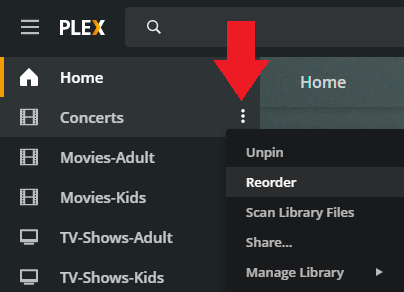
It is also similar for the Android TV app.
Correct, and that is the whole point of this thread ![]()