Hello everyone,
I’d like to start by clarifying that I’m a tester who focuses primarily on how aesthetic elements fit together and on the overall user experience, including how the UI communicates with the user. As such, the feedback I’m sharing here will likely be more useful regarding design and UX than deeper technical details.
Below, I’m also attaching my app log, as well as a screenshot showing my device information and the client version I’m using. I hope these can help pinpoint any issues more precisely.
ERRORS
-
General performance issues
-
Crash in the DVR channels section (custom or personal channels)
-
Crash when playing large files
-
Subtitle playback problem
-
Lag or low FPS in collections containing many movies
-
Occasional overlapping of titles in the movie view (see attached image)
-
Some titles include the new metadata for the movie’s title logos (the official “title treatments,” if that’s the correct term) when viewing the film from the Discover section, but this doesn’t happen when opening the same film from your personal library. I tried attaching screenshots of the two instances I had observed, but it seems I can’t reproduce it anymore, so it might have been fixed in the meantime.
-
Occasional crash in the Settings section
-
At times, tapping on a movie poster can be very slow to open. If you tap again due to impatience, the movie view ends up opening twice, so when exiting, you also have to back out multiple times.


DESIGN RECOMMENDATIONS FOR THE ANDROID VERSION
I’m aware that you’re using iOS as the base for developing the app. Inevitably, this leads to some design and consistency discrepancies on Android. Here are a few suggestions for a more cohesive design:
-
Status Bar Integration
-
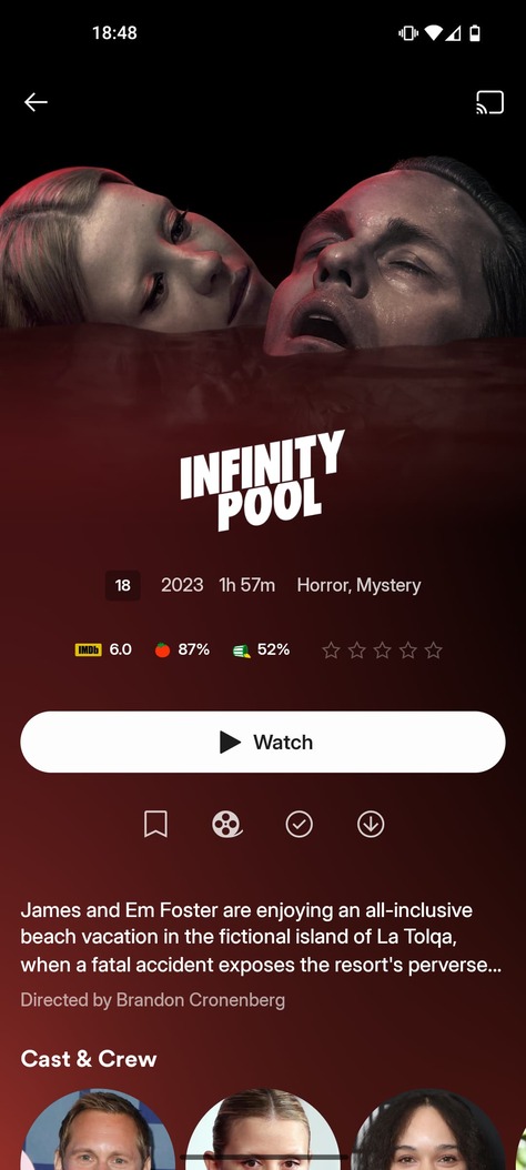
The status bar doesn’t blend smoothly—especially with lighter backgrounds—into the rest of the movie section (see attached image).
-
I believe it would look better with a black-to-transparent gradient, much like what we see in some other apps or specific movies (see attached images).
-
-
Back Arrow
- In this same view, we don’t actually need a back arrow to return to the previous screen, thanks to Android’s gesture-based navigation. Removing it would help create a cleaner look.
- If you do feel it’s necessary to keep the back arrow, please consider at least removing the circle around it to maintain a more minimal, cohesive style.
-
Bottom Navigation Menu
-
The bottom menu bar might be better integrated with a slight transparency effect (as in the attached example).
-
Additionally, some subtle animation or visual feedback when tapping on menu items could add polish.
-
I’d also recommend removing the white outer glow effect, for consistency with the top area (see attached image).
-
-
Animations and Transitions
- In general, the animations and transitions feel less polished on the Android version. Smoother transitions would greatly enhance the overall user experience.
-
Actor/Director Profile Images
- During Discover, the profile images for directors and actors take up too much space (see attached image). Reducing their size or adjusting the layout could help maintain a more balanced and visually appealing design.
- During Discover, the profile images for directors and actors take up too much space (see attached image). Reducing their size or adjusting the layout could help maintain a more balanced and visually appealing design.
-
Technical Info Badges
- Including info about Dolby, HDR, etc. as small “badges” or labels would be very helpful and more visually immediate. I assume many users have already mentioned this, but it’d be a neat addition.


FINAL NOTE
Despite these points, I want to emphasize the excellent work you’ve done. The refreshed design is truly invigorating, and the community is both grateful and excited for the upcoming changes. Keep up the great work!
Warm regards, and best of luck!
Attached:
-
App log – for troubleshooting performance and crash issues.
58794548558820.zip (93.6 KB) -
Device information & client version screenshot – to clarify the environment in which these issues are occurring.
