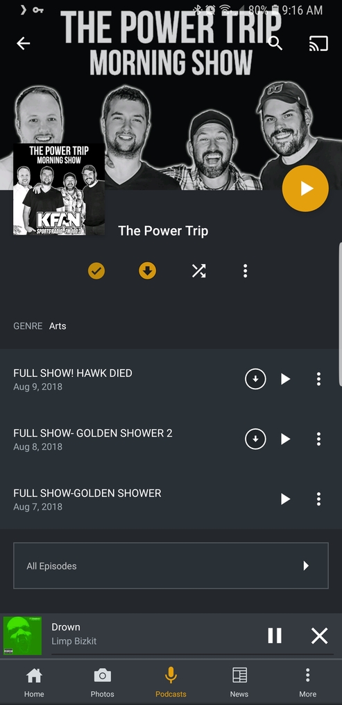
I just wanted to comment on the UI design for the Podcast section on both Web Server and Android Mobile. I understand “Podcasts” is a new feature and but I would like to see some customization and changes to it in the future. I love that it’s integrated into my Plex media platform and that I no longer have to use a 3rd party podcasting apps. I just feel like I have to dig deep into the UI when I want to find one of my subscribed podcasts or an older episode.
-
I would like the “My Podcasts” section to be customizable. It would be great to move it to the top of the “Podcasts” homepage and/or add it to my home screen.
-
The “On Deck”, “Categories”, “Popular”, and “Recently Played” sections should all have an option to hide.
-
When I select one of my podcasts, I think more than three unplayed episodes should show. I sometimes backtrack up to two weeks to listen to an episode. This would skip an extra step of clicking “All episodes”.
Keep up the great work PLEX, I hope the “Podcasts” feature does well and sees future updates.
Thank you.
System Notes:
PLEX version 1.13.5.5291
AMD FX-6300 Vishera 6-Core 3.5 GHz (6344 Benchmark)
Windows 10 (x64)
16gb RAM
OS running off of 256GB SSD
Media running off of 3 x 6TB Toshiba X300, 7200RPM
Direct LAN connection
Nighthawk R6400 wireless router
ARRIS SURFboard SB6183 DOCSIS 3.0 Cable Modem
Xfinity Broadband (90mb down, 11mb up)