I really like Plexamp – so much, in fact, that I’m considering getting a lifetime pass just for it.
However, there are a couple of little things I find confusing.
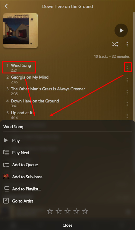
No matter where you tap (on iOS) or click (on Windows 10) in the song card, you always bring up this menu. Why not make it so tapping on the main card plays the song outright, and clicking on the three dots brings up the menu?
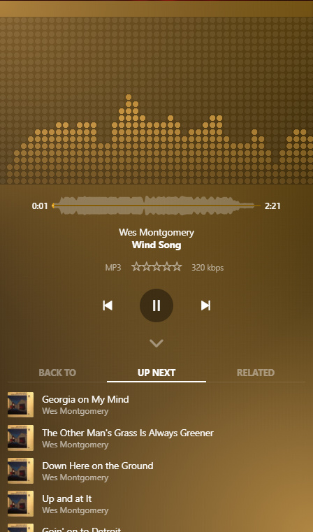
I find it a little annoying that playing a song makes it hijack your entire screen so that you have to minimize it if you want to do anything else in the app.
If these two things were fixed I think Plexamp would feel even snappier and more fun to use.
Re. issue #1, this is a design decision to help protect people from accidentally clearing their current play queue by pressing a new track. If you’re not a fan of this, you can go to Settings > Advanced > 1 Tap Track Plays to disable this.
Re. issue #2, I think I understand what you’re saying, but to make sure I’m getting it, could you describe how you’d prefer this to behave?
One perhaps more common scenario might be, playing an album (or whatever), then wanting to navigate to one or more other different albums/artists/tracks to add to queue.
 people generally want to go to the player when playing something.