Better explanation of the two navigation oddities I mentioned earlier.
FIRST
On the Profile screen - y’all should just click around because some of the up\down\back is a bit off. For example, “Back” jumps to the profile icon on this screen instead of the Home which is different from every other screen.
So on the profile screen:

When I go to the Profile screen… if I hit “down” it follows that black line to the “watched since” stats on the right instead of going to the profile icon highlighted in green which is what was expected. In order to get to the green highlighted profile icon under my User image I have to click down and then left - that’s weird. But to go back to my user icon from that profile icon I just click up once - which is expected.
Also, clicking down from Home or Library takes me to that “Watched since” box but clicking up takes me to my user icon. Just lots of odd choices in navigation direction on this page.
SECOND
On the “All Libraries” screen the navigation is inconsistent.
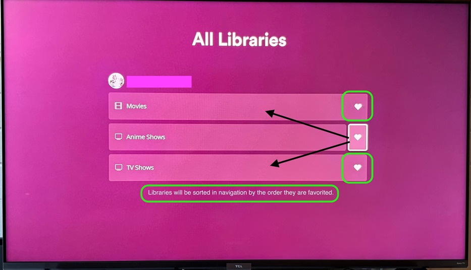
If I’m on a heart and click up or down it follows the black lines to the Library name instead of going to the green highlighted heart above or below. If a library name is highlighted pressing up or down goes up or down as expected but not in the “heart” column. That feels weird.
I also added the little bit of text as an example of letting folks know that favoriting libraries here sets the order of them. That’s not intuitive to realize as a function even if it’s been around for a bit - no new user will understand that’s the case. I realize that you’re hoping to make the favorites universal so setting it once sets it everywhere but for some folks this screen might be the first time they favorite things. Explaining on this page how to order them might be useful; and it’s not like you don’t have the screen real-estate. ![]()