Roku Preview has now been updated to the new experience (Plex would love to hear from us)

The left hand padding on the Experience UI is wider than the same padding on the old UI even though the old UI had navigation icons there. It makes the “blank” area where navigation used to be even more noticeable and awkward looking while pushing all other content further right on screen.

It might also be why the ABC navigation in Libraries gets pushed off screen via default TV overscan for some people. That ABC column isn’t lined up with the Settings gear and is REALLY close to the edge of the screen. Reducing padding on the left side wouldn’t hinder those Plex screens where there is left hand navigation included because it’s just icons only until you select them and then everything dynamically shifts right once you select those icons to allow for the text labels anyway. Making the left hand padding more compact with the profile icon seems like it might feel cleaner.

Another though would be to move the settings icon back to the bottom left like it was in the old UI which would at least give that left hand “column” some function and maybe put the clock back in the UI at the upper right (I do miss it). Settings isn’t used that often - like once you get things set you don’t go in it much - so giving it a place of UI prominence seems odd to me. Or maybe put it under the profile screen maybe where several other Plex functionality controls are located anyways (after fixing the navigation issues I mentioned earlier about that screen).

Edit: Just cleaning up some wording.

1 Like

Currently on mobile iOS you can have the app store version or testflight version only, not both.
Currently on AppleTV tvOS you can have both the app store 8.45 version (old) and 2025.16.0 testflight Plex Experienced preview version installed together.

2 Likes

The same happens with the iOS app. It’s nearly impossible to tap on a letter.

2 Likes

Also iPadOS. No response to pressing ABC
But even though close to edge of screen, no issue for me on the Roku Plex Preview.

I am currently testing Jellyfin for music since Plex is removing music from TV apps. So far, it’s working fine. My wife just wants to open the app on the Roku and play music, not cast from her phone. And I don’t want to cast either, just open the app and play music. I have used Plex for more than a decade and then purchased a lifetime Plex Pass in 2021 so I could use live tv & dvr. I really have had no problems with Plex in general until this decision to remove music. I love the remote access feature because we take a Roku stick with us when traveling.

7 Likes

So happy to see this comment. The clock is such a small think, but I love it too. Also - it is coming back! It should re-appear in one of our future updates.

Also @Insomnic_1 thank you for your other comments here. You are correct in that for TVs we have not released anything generally, and even though some sideloading has happened, we haven’t officially even released anything for AndroidTV.

9 Likes

I understand that. However, the examples I gave above are way beyond api calls.

We have one plex employee saying and I’ll paraphrase, f.e.c.k you and your tmdb rating I think they are “not good” so they are gone and with the other hand the roku team have them added.

You can see why I question the single unified client approach …

2 Likes

Yeah this one has some challenging complexities to communicate, so I will try and clarify. We had a few goals:

  • provide a common experience across all apps - over the many years our apps had diverged in some ways and we received a ton of comment around why app A has something but app Z didn’t. This recent effort allowed us to sync everything back up in a way that should be easier to provide a common experience going forward
  • reduce our client multiplier. Due to platform limitations, it currently isn’t possible to code once and deploy on every single client platform that we support. The easiest example here is Roku with their brightscript
  • we also took the opportunity to consolidate some of our API/backend functions together in a rebuild that are definitely usable across all platforms

We have also mentioned elsewhere that we have rebuilt many things using React native which allows for a unified codebase across many of our clients. So, yeah, a blanket “single code base” isn’t technically accurate, but if you wanted a consumable concept I would say:

TL;DR; unified codebase everywhere we could, unified backend, overall quicker and easier and more consistent functionality across everything.

Edit - I am going to amend my statement slightly. Originally I had “Or in other words, more cool stuff quicker :wink:” at the end of that but given the tone in the forums right now that probably doesn’t carry the lighter tone in which it was intended. Apologies. We are starting to see this value internally and have even gotten feedback from people noticing releases quicker and with more content in them so that promise is being realized but I acknowledge we have a ways to go before I can make light of that in a way that doesn’t sound flippant.

4 Likes

But you are still missing the point made by @dokuro! Who cares about the code itself; but why when the EXPERIENCE is unified, are some of the apps being published with different approaches to UI. I couldn’t care less about TMDB ratings, but it should be available on all devices or none, at least!

2 Likes

Plex released an update to the Plex preview - 8.0.0

FIXES:

  • Add source titles to the Home hubs.
  • Fix migrating pinned sources to favorite libraries on first run.
  • Initially focus content instead of header.
  • Make episodes list position fixed.
  • Update content when favoriting first library or removing all favorites.

Once I got some rest and settled down, I realized that this was the “preview” app (which I’ve used up to now) and hasn’t been expanded to the general app. I’ve moved over to that one and have my regular experience back.
Rested or not, I still hate this new UI. I do not find it at all intuitive. Either that or it has intuitively wrested any control I used to have over removing the promoted garbage it puts front and center of my “Home” screen—no longer making it “my” home screen, but essentially Plex’ ad screen for promoted trash.

2 Likes

You do realize that at some point the Roku Plex Preview App becomes the Roku Plex App? Better to get used to it now, or plan on other alternatives.

2 Likes

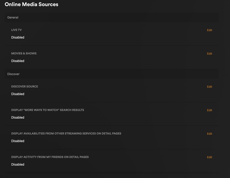
If you go to your account level settings vs client settings you can turn off the Discovery stuff and you won’t see it on your Home Screen or mobile in the new Experience. It’s in the Online Media Sources section. I think it’s easier to do this via web.

In my Home Screen on Roku I have Search, Home and Libraries. That’s it.
On my iOS devices, the bottom just has Home and Library. I’ve got none of the other services showing up. I send this same info to my friends\family hitting up my server in case they want to turn it off themselves - they were getting thrown off a bit about which stuff was mine and which was Plex’s… I was getting “why am I seeing ads?” questions from a few of the less savvy folks. :slight_smile:

I also set ‘Ratings and Reviews From’ to No One which turns all the reviews off (you can pick other options). That’s in your main Account settings page.

In the older UI you could remove a lot of that stuff just by changing settings on the client but the FULL way to remove it all is to disable it at the account level. The new Experience being more universal seems to be designed more for account level controls that filter to the client rather than granular client controls (favorites will work the same way evidently).

The new Experience, with all that stuff disabled for myself quite some time ago, hasn’t felt too terribly different really. A lot of the navigation woes I was worried about are more just odd for me than frustrating. I don’t use Live TV or DVR or any other services though so that might make a difference compared to others.

I still would like the background image to fill the screen and be static and dimmed on the details page rather than filling only part of the screen and disappearing when I scroll down - I like the ascetic of the static background image. I picked it I wanna see it. :slight_smile:

I’ve also customized my Home Screen with custom collections and hubs to make it work for me better than the default options so I don’t really leave the Home Screen to dive into libraries that often. I still think that the new navigation has introduced more “clicks” to get to the libraries but at the same time they load faster (and I do prefer the click to load after selecting rather than the previous automatically load as navigating - that would cause my sluggish RokuTV to stall trying to switch libraries or get to settings).

I only mention this stuff not to defend anything but it’s not like they’re going to back down on the UI changes for navigation so these might be ways to work within the Experience to make it less frustrating or annoying or clunky. You’ll notice most of my suggestions are ways to tweak what exists rather than overhaul stuff… past Plex might’ve been willing to change those things (like like previous UI attempt Lazarus_Long posted) but not current Plex.

I also currently have some extra time on my hands so this gives me something to do. :slight_smile:

Edit:
Because I was asked before, just a quick mention of my Home Screen customizations in case it helps others:

  • I removed the built in “recently released” movie row and created my own smart collection and added a row called “recently released unwatched” instead. It works the same but doesn’t include any titles that are watched; this way ones I’ve already watched don’t show up so I don’t have to click past them. Keeps it kinda cleaner for me (I also have watched indicators for Movies turned off - I know what I have or haven’t seen).
  • I have a Smart Collection for “not watched recently” which has a row on my Home Screen. This collection includes 30 movies I haven’t watched at all, or haven’t watched in over 3 years, selected randomly. It changes dynamically.
  • I have a Smart Collection for “Nostalgia Action Movies” which includes 30 movies with genre action and release decade 80s/90s/00s selected randomly. Also changes dynamically.

So: Continue Watching, Recently Added in Movies, Recently Added in TV Shows, Recently Released Unwatched Movies, Random Not Watched Recently, Random Nostalgia Action Movies, Recently Added in Anime Shows (2nd TV Show library).

These rows help remove decision fatigue when trying to simply find something to watch over browsing through hundreds of titles in my library. I worked at video stores for years… having a selection to choose from makes it easier sometimes. :slight_smile:

3 Likes

Better explanation of the two navigation oddities I mentioned earlier.

FIRST
On the Profile screen - y’all should just click around because some of the up\down\back is a bit off. For example, “Back” jumps to the profile icon on this screen instead of the Home which is different from every other screen.

So on the profile screen:

When I go to the Profile screen… if I hit “down” it follows that black line to the “watched since” stats on the right instead of going to the profile icon highlighted in green which is what was expected. In order to get to the green highlighted profile icon under my User image I have to click down and then left - that’s weird. But to go back to my user icon from that profile icon I just click up once - which is expected.

Also, clicking down from Home or Library takes me to that “Watched since” box but clicking up takes me to my user icon. Just lots of odd choices in navigation direction on this page.

SECOND
On the “All Libraries” screen the navigation is inconsistent.

If I’m on a heart and click up or down it follows the black lines to the Library name instead of going to the green highlighted heart above or below. If a library name is highlighted pressing up or down goes up or down as expected but not in the “heart” column. That feels weird.

I also added the little bit of text as an example of letting folks know that favoriting libraries here sets the order of them. That’s not intuitive to realize as a function even if it’s been around for a bit - no new user will understand that’s the case. I realize that you’re hoping to make the favorites universal so setting it once sets it everywhere but for some folks this screen might be the first time they favorite things. Explaining on this page how to order them might be useful; and it’s not like you don’t have the screen real-estate. :slight_smile:

1 Like

Same here (except I have Live TV for my DVR). The only difference in the new UI for me is the Menu on Top, and the removal of Music and Photos (major change), and the missing DVR Functionally (promised “to come”).

Took almost a day :grinning_face_with_smiling_eyes:, but I’m liking the new UI (not the missing pieces though)

2 Likes

Last bit from me for now … I said I had some extra time on my hands. :slight_smile:

The left hand padding.

Here are two screens where the right hand content is REALLY close to the edge and by reducing some of that left hand padding - padding that is even larger in the Experience than it was in the original UI - I think it’d give that right hand side some space\padding and keep the entire UI from looking so weighted to the right of the screen.

Library navigation via ABC:

If you remove some of that extra padding on the left (green) to shift everything except for the top nav and the setting icon, I think that’d help balance things out a bit. It would pull that ABC row away from the edge (red) which is so close some folks don’t see it because of their TV overscan and if if it shifts left a little it’ll line up with the SETUP icon (blue) which will feel a bit more unified. In my opinion.

I think there’s still plenty of padding for the left hand navigation icons on that screen - particularly since it dynamically shifts content anyways once you navigate to them.

Continue Watching\On Deck:

Similar thing here… if you remove some of the padding (green) it’ll shift everything left a little bit to be centered on the screen and it’ll pull that up next summary away from the edge where there’s no padding (red).

Also, you can see by comparing the S4E2 On Deck middle image with the TCL logo on the TV that this screen is not centered - it’s shifted right of center - when it could be centered if you reduce that left hand padding. Edit: In current UI it is actually left of center which points out how far everything in the new UI is shifted right.

I think reducing that left hand padding would really help the Home Screen and other screens too as I said it makes the whole experience feel like it’s off center (and on some screens it actually is) but I wanted to give a functional reasons for the suggestion. :slight_smile:

Edit: forgot to include a positive note in my criticisms…

  • The UI is much snappier and even the dynamic stuff like picture resizing and color changes in detail screens and art loading\resizing doesn’t feel sluggish or “hesitant” - if that makes sense - even on my sluggish RokuTV.
    Also, thanks for not having dynamic background on Home Screen. I used to turn off the dynamic colors because it slowed the entire UI experience down and it was super distracting on Home Screen but now it works just fine. I don’t always like some of the choices of color but it’s fine (sometimes it picks one small bright color to use instead of the overall tone so I’ll end up with all orange\red background because a character has red hair despite a mostly black background image). Might be nice to still be able to turn that off though and be static to the theme color in case folks want “Dark” the whole time. I use “Midnight” theme on my bedroom TV because it’s dark enough for when it’s lights out without being so dark as “Dark” but some backgrounds jump in with brighter colors and that can be jarring. (sorry for adding a critique in the compliment section)
  • When navigating libraries, I like that you have to click on it to switch to it and that it doesn’t auto-switch. That autoswitch to every library as I passed through it to get to settings was annoying.
  • I don’t know if it was there before but during playback, pressing down and getting the chapter navigation right there is helpful. If it was there before it didn’t feel as clean to get to it so I always forgot about it over just scrubbing the timeline but I noticed it now and will likely use it more than I did before.
  • I appreciate that y’all are making quick changes to specific items mentioned here. It’s appreciated - the fix to start focus on continue watching instead of navigation was a small but noticeable QoL improvement.

Edit2: Man I do have a lot of different animation in my screenshots… don’t judge! :slight_smile:

Edit3: Forgot to mention the left hand padding in the Experience UI is even wider than the same padding in the current UI and switching between Preview and Public makes it more obvious.

If you hit “BACK” multiple times on the remote it takes you to a “switch user” or “exit” option screen. I don’t use that feature but found it by accident hitting BACK too many times and seems faster than using the profile screen (with the janky navigation too). :slight_smile:

1 Like

I like the idea of it, but it would be great if there was a way to have some individual selections across devices. I have a 4K folder so that those files are not shared with remote users, but I don’t need to see this folder on devices that don’t support 4k.

Also noticed that background artwork does not show up for collections anymore. Or can’t find a setting to turn it on. Background art is on android app for collections.
Old Roku app:

New Preview:

I don’t need it to be full screen, but if it could match the new artwork of the movies itself that would be great. Not a fan of a blank screen.

4 Likes

I’ve been trying to think of something nice to say about the new interface but the new navigation is such a backward change, so many more button presses needed for simple library access that it’s overshadowing any improvements.

Please put the libraries back on the left where they’re useful and simple.

3 Likes

I just started testing the Plex Preview for Roku and I will say I like the overall graphical improvements, however the navigation and user experience is a HUGE downgrade. It takes two to three times as many clicks to do anything. I still remember an old addage from the early days of the web “if it takes more than three clicks to get anywhere, your layout is flawed.”

Example; I’m on the home screen, I browse down through the list of recommendations, don’t see anything I want and want to go to a library? I now have to scroll ALL THE WAY BACK TO THE TOP, which can be 4-five clicks, then click libraries, then down then scroll over to the library I want, then click, then if I want to browse all of my shows (because it doesn’t remember my last view), I have to click down-left-down-click. I’m now 20+ clicks to get to the screen I want. It’s ridiculous.

In the old interface, I could have libraries pinned to the left sidebar, same scenario, left, scroll to library, click, and I am right where I want to be with the view I last used for that section.

The flip flopping of the settings and primary navigation is a HUGE DOWNGRADE. Put the main navigation back on the left. Everyone else in the industry (Roku, Disney, Netflix, Hulu) has standardized on that format for a reason and they likely spend millions on UI research. The one that doesn’t (Amazon) has a shortcut on the left to go back home that you can immediately scroll through the top bar. Also, bring back pinning of libraries to the primary navigation bar.

5 Likes