Last bit from me for now … I said I had some extra time on my hands. ![]()
The left hand padding.
Here are two screens where the right hand content is REALLY close to the edge and by reducing some of that left hand padding - padding that is even larger in the Experience than it was in the original UI - I think it’d give that right hand side some space\padding and keep the entire UI from looking so weighted to the right of the screen.
Library navigation via ABC:

If you remove some of that extra padding on the left (green) to shift everything except for the top nav and the setting icon, I think that’d help balance things out a bit. It would pull that ABC row away from the edge (red) which is so close some folks don’t see it because of their TV overscan and if if it shifts left a little it’ll line up with the SETUP icon (blue) which will feel a bit more unified. In my opinion.
I think there’s still plenty of padding for the left hand navigation icons on that screen - particularly since it dynamically shifts content anyways once you navigate to them.
Continue Watching\On Deck:
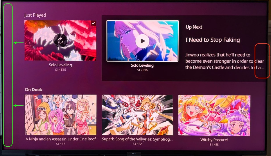
Similar thing here… if you remove some of the padding (green) it’ll shift everything left a little bit to be centered on the screen and it’ll pull that up next summary away from the edge where there’s no padding (red).
Also, you can see by comparing the S4E2 On Deck middle image with the TCL logo on the TV that this screen is not centered - it’s shifted right of center - when it could be centered if you reduce that left hand padding. Edit: In current UI it is actually left of center which points out how far everything in the new UI is shifted right.
I think reducing that left hand padding would really help the Home Screen and other screens too as I said it makes the whole experience feel like it’s off center (and on some screens it actually is) but I wanted to give a functional reasons for the suggestion. ![]()
Edit: forgot to include a positive note in my criticisms…
- The UI is much snappier and even the dynamic stuff like picture resizing and color changes in detail screens and art loading\resizing doesn’t feel sluggish or “hesitant” - if that makes sense - even on my sluggish RokuTV.
Also, thanks for not having dynamic background on Home Screen. I used to turn off the dynamic colors because it slowed the entire UI experience down and it was super distracting on Home Screen but now it works just fine. I don’t always like some of the choices of color but it’s fine (sometimes it picks one small bright color to use instead of the overall tone so I’ll end up with all orange\red background because a character has red hair despite a mostly black background image). Might be nice to still be able to turn that off though and be static to the theme color in case folks want “Dark” the whole time. I use “Midnight” theme on my bedroom TV because it’s dark enough for when it’s lights out without being so dark as “Dark” but some backgrounds jump in with brighter colors and that can be jarring. (sorry for adding a critique in the compliment section) - When navigating libraries, I like that you have to click on it to switch to it and that it doesn’t auto-switch. That autoswitch to every library as I passed through it to get to settings was annoying.
- I don’t know if it was there before but during playback, pressing down and getting the chapter navigation right there is helpful. If it was there before it didn’t feel as clean to get to it so I always forgot about it over just scrubbing the timeline but I noticed it now and will likely use it more than I did before.
- I appreciate that y’all are making quick changes to specific items mentioned here. It’s appreciated - the fix to start focus on continue watching instead of navigation was a small but noticeable QoL improvement.
Edit2: Man I do have a lot of different animation in my screenshots… don’t judge! ![]()
Edit3: Forgot to mention the left hand padding in the Experience UI is even wider than the same padding in the current UI and switching between Preview and Public makes it more obvious.