@McWanke,
Plex Preview,
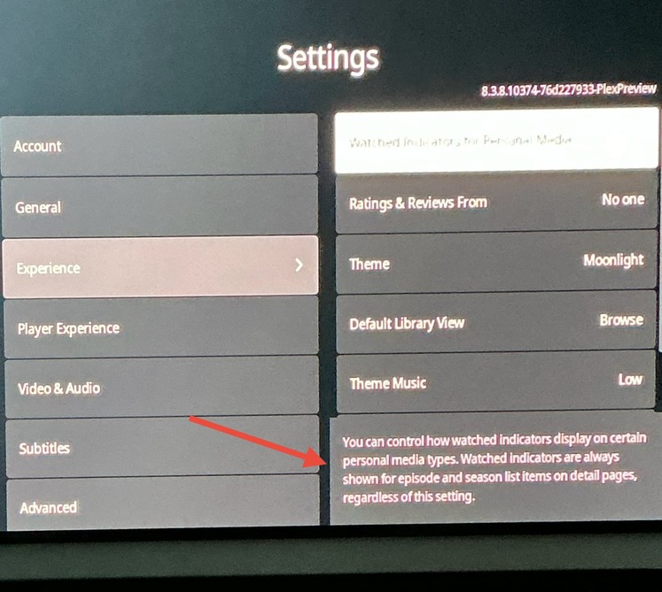
When Watch Indicators are set to None for Movies and/or TV Shows the Watch Indicators are not shown for episode and season list items on detail pages (which are supposed to be shown regardless of setting
Thanks for the report. I’ve filed it internally and we will investigate.
1 Like
Thanks for the report. I’ve filed it internally and we will investigate.
1 Like
Nice to see Plex making a reversal on this decision. Should make lots of folks happy.
3 Likes
Update to the Plex preview channel - 8.4.0
NEW:
FIXES:
- Don’t display activity from friends on detail pages when it’s disabled.
- Don’t show inline metadata for the Browse Libraries hub.
- Fix a possible crash loading or refreshing a screen.
- Fix focus being reset when marking a season watched from the episodes screen.
- Fix OSD not showing on key press down during Live TV playback.
- Fix padding below header and add missing link icon on Profile screen.
- Fix showing watched indicators on Season and Episode detail pages.
- Prevent cinema trailers from playing when resuming a movie.
- Show hint of first hub on episodes screen.
Special note - for additional information regarding Music and Photos please see this forum post
1 Like
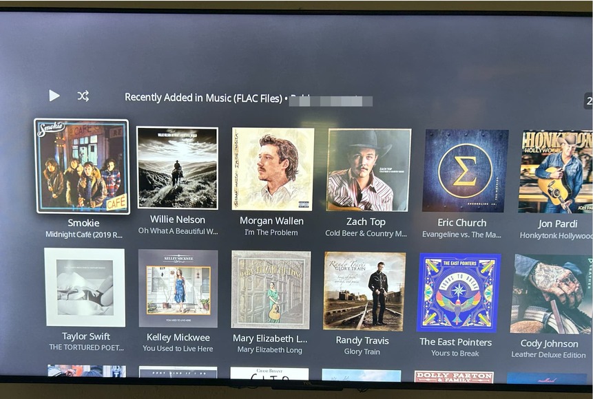
Since music has been added back to the Roku Experience Preview app, would be interested in seeing some screenshots of how it looks. Anyone out there able to oblige?
2 Likes
Since music has been added back to the Roku Experience Preview app, would be interested in seeing some screenshots of how it looks. Anyone out there able to oblige?


1 Like
That libraries carousel is awful! It’s far worse on TV.
2 Likes
Hah! Exactly, it’s fine for a basic setup but isn’t practically scalable.
2 Likes
Plex has been pushing, for the last few years anyways, that people should typically only have one library per content type as the “best practice”. I think it’s seen in their more recent designs that’s their expectation as well.
I kinda get it and have reduced my libraries over time now that a lot of the reasons for multiple libraries with Plex is gone; sharing controls, bandwidth controls, version and edition management, family controls, filtering controls, better hardware\software transcoding and client direct play support.
I don’t really need granular libraries anymore but merging libraries sucks because you lose a lot. You’ll keep your watch history but that’s about it; artwork will reset, thumbnail creation and intro detection resets, continue watching will reset, collections will need to be recreated, and “recently added” hub will get flooded with the new titles. I recently merged my Anime TV show library with my regular TV show library - the last holdout of unique library setup - and went through it. It’s not horrible but something to keep in mind. It’s not the same as switching folders\files around within an existing library.
If you setup local artwork already or add it before the merge that’ll help. I think this is where NFO files come in handy.
Edit:
I just don’t know why they added it as a dedicated row on the Home Screen too. Feels redundant and throws off the clickthrough of rows (as well as not having partial rows visible to help with the flow but I already covered that earlier ad nauseam).
2 Likes
It’s not ideal for sure, but given the choice of no music / photos on Plex for Roku or a design that maybe at some point they’ll fix, I’ll take the terrible design any day of the week. At least this is one of the few occasions Plex listened to the multiple complaints about no longer being able to get to our music or photos.
2 Likes
I don’t think Plex realizes (at least not very well), that users use PMS for more than Movies, TV and Music! I’ve got libraries for:
TV Shows
Movies
Adult Movies
Adult Scenes
Adult TV Shows
Music Videos
Exercise Videos
Concerts
Warner Brothers Animation
Holiday
Marquee TV
(and probably some others I’m not thinking of)
Now I know I could combine some of these, but it honestly separating stuff out makes it easier for my users…
4 Likes
This is why Vertical Lists make WAY more sense than Horizontal Lists. I said this the last time they rolled out a horizontal menu…
Nobody lists things horizontally.
5 Likes
“for my users” I think is where Plex expectations has moved away from quite a bit; or at least it’s even more niche than people running their own local media server for themselves these days.
I used to have to manage with multiple libraries too - particularly WAY back in the day - and it’d be nice if Plex provided a good way to merge libraries.
As far as functionally combining those and still separating them out… here’s how I’d do it. Not that you asked but I kinda thought about it anyways. ![]()
The “adult” stuff could be given a label and that’ll manage access per user pretty easily - though it’d be useful to have a way to set titles with a label ahead of time like with a filename keyword similar to editions. If it’s actual porn and not just R-rated vs Kids stuff - hey, I worked video stores with adult rooms with the swinging saloon doors, I get it - and I wanted to have a lot of control over access and not have it mixed in with non-adult titles I’d probably actually setup Jellyfin to manage it as a completely separate setup that way I’d have full isolation including client access on home devices. Otherwise that does seem the most likely to not merge.
Exercise Videos, Concerts and Holiday would get their own Smart Collections using genre tags which I’d manually set and lock if they didn’t get picked up. I do that now with Anime movies and tv shows. Holiday I actually just let Plex do their “holiday row” they put up occasionally with that server side setting for that dynamic feature. You can set collections as home and library recommend rows so you could make those more front and center for users.
Warner Brothers Animation - depending on why you have it separated out, either label or smart collection.
Music Videos - Music library works with music videos too so that makes sense to keep it separate though mixing it with actual audio files probably depends on how you use it. You name the music video files a specific way and they go with the artist along with their albums and such but I don’t know how well they mix in but that I could totally see being it’s own “Music” library separate from an audio only music library.
I’m not sure what Marquee TV is but I’m guessing “high quality” shows? Again I’d go with collection or smart collection.
I really like the collection and smart collection feature of Plex and Emby\Jellyfin don’t have it - particularly being able to add them to Home Screen as their own hubs. I have a few that help with decision fatigue and bubbling up titles without having to browse the entire Library screen of 100s of titles. Emby is supposed to get it with v5. ![]()
For me, having my Anime shows dedicated library was really convenient to have separated out because it reduced the decision fatigue of folks browsing theTV library who didn’t care about anime and kept it outta the “recently added” home rows for regular TV shows; particularly subbed anime. That separation was starting to get a bit blurred as more anime is released with dual audio - that doesn’t suck - and is more common for main stream folks to watch so I was getting “anime” or “anime-ish” shows in both libraries. I also have way fewer users hitting my Plex than I did in the past now that streaming services have become more standard. I also don’t keep many TV shows after watching them except for a few so that’s different than a lot of folks. I’m pretty judicious in deleting stuff.
Organzing libraries and content management would probably be a good review\topic to break out for more discussion just to see how folks are managing their content. Plex introduces new features and functions that don’t always get notice beyond a line on the release notes so who knows what some of us are missing. ![]()
Didn’t they try this last UI revamp several years ago and it got reversed for basically this same reason? Just was cumbersome.
I don’t really mind it too much in the Preview only because I only have a few libraries and I setup my Home so I don’t really have to leave it often (which is why I don’t like have the dedicated library row) but considering how much empty padding they are leaving on the left side in Experience - more left hand side space than in Public which does have navigation there - I don’t see why they couldn’t put it there.
I think it’s less of an issue on mobile because that’s a touch screen and different environment.
Edit: apologies for the kinda long off-topic-ish post. ![]()
That’s the burn of making the change… is that the space is still sitting there, unused. Then… if you dive deep enough, it DOES get used, but it feels so out of place to go over there to use those functions. It feels totally disjointed.
I feel like it works best in totally the opposite way. Primary navigation vertical. Secondary, fine tuning done on a horizontal subset.
Having things listed horizontally really digs into the real estate that content should exist on. If you’re going to roll something horizontal, it should be done sparingly, not as the primary form of getting around. I want to see stuff. I don’t want things getting in the way.
I keep telling myself that I’m only in the interface to get to the stuff, and that I spend most of my time consuming the stuff… but damn… they really want to make it as unintuitive as possible to get to. This feels like change for change sake. Sure, it looks good.. maybe… but functionally, it’s a stone tablet step backwards.
EDIT: I say this only for TV interfaces. As I think more about it, primary navigation should always exist on the shortest edge of your device. Following that rule, nav on the phone going horizontal is perfectly fine.
4 Likes
And if you look at my earlier screenshots content is shifted even MORE to the right now. So they are literally wasting even more space than if they actually put navigation there. It feels so weighted to the right now it’s awkward. It looks like stuff is missing.
And when they do have navigation on the left it’s dynamic anyways! It expands when you use it and shifts content over to fit.
It’s a wide screen… use the sides where’s there more unfocused space and let content fill more of the focused central space. ![]()
They pushed the rows down so now there’s only one row and then just the header of the next row… which doesn’t give the “there’s more, scroll down” indication like the current build does showing the top 3rd of the posters of that next row (again, see my earlier screenshots and ad nauseam text posts). ![]()
Edit:
Yup… agree. Touch screens in hand vs TV screens via remote are different.
2 Likes
You have a point, but I was talking about multiple libraries of the same media.
Plex - and other media center software - used to recommend breaking things up into multiple libraries particularly for movies for managing 4k vs SD or high bitrate vs low bitrate or kids movies or just genres. It was common even with XBMC to do that because there weren’t better options at the time. Once you started doing it that way it became cumbersome to switch it around (unless you had your NFO and local assets setup really well to minimize it - and Plex doesn’t do NFO currently).
I’m trying to think when plex reps - and honestly all of the media centers - started reversing it and it’s gotta be several years ago. So this is probably more of a thing for “old school” admins. ![]()
I do think they want outta some aspects of media management though and honestly photos and music is probably pretty low on their “returns” list as most folks use the built in photo apps on their phone and music streaming services. They’ve also never expanded to audiobooks (sorta mildly supported in PlexAmp) or books and comics and I would be surprised if those are still on the roadmaps from years ago at all. Emby and Jellyfin support those other categories and there are other apps out there now specifically for it too.
So yeah - their business model is focused on their services and not local media and the less they have to support the easier it is for them that’s for sure. And I definitely agree the fumbled the release.
1 Like
I’m not seeing any carousel for Music (or pictures) on my Home Screen.
To see Music or Photos, I Favorite them in See All Libraries, and then I see (almost) the same layout as I do in the non-preview app
Right ! First off I just want to say a huge thank you to Plex !
Thank you for listening to us! Having photos and music (especially photos) back in the TV app has saved me from potentially having to sit through hours of our grandparents ranting down the phone to us about how they can no longer see pictures of their grandkids!
So I thank you.
Now onto my next request (and I know this is covered in other posts and other feature requests) however I, and many many others have spent countless hours curating our collections, we’ve used PMM to create clever collections. Some of us (not me) have even crated custom title cards for our tv shows, just to make the experience that little bit more slick and personal.
With all this in mind Plex is missing a massive trick. One that would make “Film & TV aficionados” spend hours on their plex servers curating their next clever offering for the family members (or whoever) their share their collections with.
I’m talking about custom TV channels (that can be shared with people they share their library’s with)
I really want the ability to setup custom tv channels using the media collection I’ve carefully curated, and be able to share this with friends and family. That’s it
Sorry if this was a bit wordy, but I’m appealing to plex strategy people.
Cheers
D
2 Likes
Yay! ![]()
2 Likes