Roku Preview has now been updated to the new experience (Plex would love to hear from us)

What a navigation mess this is … I want to select Movies or TV Shows and then BROWSE my content (filtered for unwatched). This used to be simple …2 clicks… Now it is scrolling to libraries, scroll to Movies, scroll to Browse…

And then in browse mode, the posters are now too large… so I can get one full row, and two half rows (upper/lower) on my 4K set.

Just give me shortcuts to TV and Movies that default to scroll view with the ability to control how many rows/columns are present. This new “improvement” is a full nuisance. And if I’ve missed something obvious, please tell me. This update is a negative experience for me. For now… I direct my friends to alternate streaming platforms.

And we end up with the “lowest common denominator” result. How sad.

6 Likes

@McWanke PLEASE implement this. You can see similar comments here.

2 Likes

Back button once (maybe twice)

2 Likes

My 2 cents…

  1. Why on earth do I have to select my own server to access the Live TV Section?
  2. Why do I need to hit the * button to set up a recording?
  3. Why is so much of the screen taken up by a blank space to the left of the screen?
    (the Guide is pushed down into the right with minimal screen real estate for actually seeing what is on and upcoming :man_facepalming:)
  4. Way too many hoops to go through to get around what used to be all accessible from the collapsing menu on the left.

There’s a dedicated setting now in Settings -> Experience to configure the default view for your libraries (Recommended or Browse). Set it to “Browse” and it will always start you there.

1 Like

Found an update I like - Discover for Cast now works with Editions tags in my local library. This means if I click on an actor image from a details page it’ll now show movies in my library they are also in even if set with an edition tag. In the current UI that doesn’t work - it won’t show you titles with Edition tags.

I had a feature request for it here with details.

Now if you click on an actor in the Cast\Crew row it’ll show those Editions titles in the list and if there’s multiple editions it’ll add a +1 or +2 next to it.

The only hiccup is if you pick a title from there that has two editions it takes you to a screen that shows you two choices with no info for which is which and gets further confused if there’s multiple versions as well (only shows one version even if there’s two). Plex has had similar oddities with picking from multiple editions and versions in the current UI too so that’s not new but that’d be nice to improve.

Nice to see that working now. Small QoL thing. I’ll mark that feature request completed. :slight_smile:

The more I’m using the preview release the more intuitive it’s getting and honestly it’s mostly an improvement for me and I was extremely trepidatious. There’s still some oddities in extra clicks for some things but not things I use daily. I don’t use Photos or Music on my TV though and don’t have lots of Libraries to navigate - 1 movie, 2 TV - and customized my Home a bunch (see previous comment) so that helps for my case at least. :slight_smile:

I recommend folks with separate libraries for different resolutions look into combining those into just one library if they can. Plex handles version selection automatically better than it used to so less need these days. I made this change myself several years go and it’s been fine and is one reason switching out Plex for Emby or Jellyfin would be an extra hassle for me (they don’t handle multiple versions automatically). Just to give more context for my perspective on Experience.

@McWanke This thread is getting pretty long. Maybe it might be useful to take some of the repeating stumbling blocks and bugs that have been flagged - like using BACK to jump to Home instead of using the D-Pad or that the clock will be back in a future release - and put them in the top post maybe? Or a dedicated Pinned post with some of them like a FAQ for “new Experience tips for Roku users” or which reports bugs are on the books to be fixed? Just a thought as some folks are frustrated and understandably missing some already sorted things in the 140+ posts. :slight_smile:

Edit: Just tested this in iOS New Experience and it works way nicer there - shows all the editions separately including my custom posters for those editions (like the several Star Wars fan edits I have).

1 Like

I concur. This new experience is a really unfriendly user experience. I am sure my over 60 household is not the Plex demographic, but we have been Plex supporters for over a decade and we have a hard time figuring out how to get to our content. I also miss the music.

How about a Roku PlexAmp app?

4 Likes

@McWanke, Plex TV Live Guide for Plex Channels is not showing Date or Season

For Example Hot Ones only shows E1 (when it should show Season, Episode, Date and Rating (I.e. TV-MA)

Roku Plex Preview:

It still has the same problem with duplicating movie selections/posters in hubs/rows when using Random sort. This is still happening in the older Roku app as well.

When beginning stream, it can be quite sluggish and at times appears to stop loading while spinning the buffering wheel.

The Background image pop-in is inconsistent. Sometimes is swipes in from the top right other times is just appears with the rest of the details (usually on the first movie selection from my library on an actor’s detail page). The worst offender is when you sometimes select a movie and then later selection another movie: the first movie’s background briefly swipes in and then disappears and the second movie’s background swipes in to replace the first. I haven’t found a way to consistently reproduce it but it does happen some what often. Last time I was looking at a movie’s details. Then I went to Search. Picked the second movie.

FYI, I don’t like the swipe in and prefer a fade-in. The swipe makes it feel like the Roku UI is trying to align a misalignment.

1 Like

On the good side:

It’s obvious this build is using the old Roku code. It’s fairly stable overall. It’s fairly snappy. This isn’t the mess found in the new mobile apps. It took a while to get use to the HUGE backgrounds in the details but it’s growing on me.
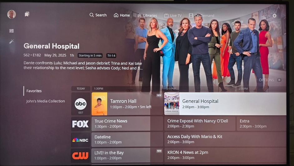
Some feedback:
Menus:
It’s a little awkward when the left menu comes into play; for some reason it throws my brain training out of whack trying to get to that left menu. I’m too used to using the Back button to reach it.

I’m not against the new menu layout, because the old one wasn’t so hot either. I don’t think this new one fixes the problems and might add a new one: the left menu icons are pretty meaningless (especially collections - tags?) and since there is no text initially to go along with them, it isn’t obvious what the left menu actually does. This is a similar problem to the old left menu on Roku. All my senior users would get stuck just browsing the hubs on the home screen and I had to start using Kometa to rotate hubs/collections daily.

The new libraries menu just never fits in on any of the new apps. I know what you are trying to do (not hide it), but it just creates a new third menu in this layout that wasn’t there before (it was integrated with the main menu - home, search). It isn’t awful, but awkward. I get why you separated it however (it can grow and shrink depending on the server).

I feel like you should leave the top menu (“Home”, “Search”, etc.) in place throughout the entire UI. Less backing out after digging deep.

With the HUGE backgrounds, the problem is that is pushes down the “next” row/hub of posters. I see you left the next row/hub header but you don’t see the top of the posters. I think this makes it less intuitive to older/senior users because it doesn’t look like anything is cut-off, which encourages you to explore downward.

However, and honestly, if this app was released today, it probably wouldn’t get quite the flak as the mobile apps in terms of UI experience, except the no music and no photos with no apps on Roku to replace them. We lose the ability to use our TVs as jukeboxes (music) and as old slideshow screens (photos).

I’m going to post this next part elsewhere too, but this background focus on the right side of the image does not fit the focus on the middle in the new mobile apps. You are making it VERY DIFFICULT to pick backgrounds. Do I find one that focuses on the middle or the right? This is really a pain.

Thanks for the efforts on this new app.

1 Like

Forgot to mention, “Where are the ratings?”

All this new space and someone couldn’t add the imdb/rotten tomatoes ratings when browsing a row/hub?

+1 for missing the clock on the Roku app.

2 Likes

Just gave the Roku preview a trial run last night with the family. It worked quite well for watching a couple tv shows. There were some hiccups when loading some pages but it would eventually do so (a couple seconds later).

The large backgrounds are growing on me and for some reason, last night I didn’t see the swiping motion. It appears the swiping motion is a hang over from how the background expands into place from the prior smaller version on a hub/row view. I’m honestly not sure what motion (if any) Plex, Inc. is trying to achieve with these. The expanding is nice, but otherwise going from a Browse Library view, a fade in is best.

2 Likes

Not Preview related, but I don’t understand why a Plex show in English has all its commercials in Spanish.

I personally don’t think the miniscule amount of offering on the right hand side of the screen in this example is a big deal and I don’t think it would name my Plex ‘experience’ any better if it changed (or stayed the same.)

That said, I do find the padding, and non-collapsing menu on the left off the screen in Live TV much to large and doesn’t give enough room for the TV guide .
Changing this would improve my experience when live TV and DVR functions.

3 Likes

I’ve been experiencing this to on my home network. I’m not sure if this is a server side update issue or an issue with the new Experience.

Speaking of performance, even opening a Library for the first time in a session, it can take many multiple of second (15?) for the library to load. However, after that, successive movie/series open very quickly.

If the Plex client is caching this data, it’s working great and if that’s the case, AND this time can’t be reduced, it might be helpful to add a dialog saying the Library is caching or pre-loading so it sets expectations and overall, explains why opening a library is taking so darn long! :wink:

That was the 1st thing I commented on. Plex should have the Guide Selections (favorites, etc) horizontal above the guide, as it is in the Roku (non-preview) App with more real estate for the Guide . Plex moved the menus horizontally, but this they changed to vertical? (change for change sake)

I personally think they need to stay with the new Experience design language and not revert back to the old, non standard/constant UI.

It’s way too early to start “tagging on” bits to the UI.

That said, it might be a good time to tweak aspects of the new Experience while development is still ongoing and they have designated resources for the new apps.

I think that they could just have the menus on the left disappear as the user scrolls right (advances the time in the grid).