Server Version#: 1.16.2.1297
Player Version#: 2.39.0.1005-1b0839a8 (Plex Media Player)
Player Version#: 1.0.0.792-d4adb056 (new Plex)
This is something that’s been bugging me for a while, and I hoped that the new Plex app would bring some change, but it didn’t. So the problem is identical in both apps.
In the Music category I get a spurious “Stations” row of icons: “Library Radio”, “Time Travel Radio” and “Random Album Radio”.
Those are unwelcome. I know how to use and listen to my library on my own, and I hate any form of randomized playing. Moreover, they are in the middle of the page, right between other things that are much more useful.
I went to every option I could think of to remove them, or send them to the bottom of the page, to no avail. Did I miss something, or is it one of those forced things that Plex seems to be fond of?
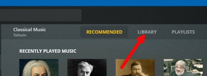
Is this really an issue? I only see Stations if I have the ‘recommended’ tab selected at the top. If you select ‘library’ then your library shows as normal. Selecting that tab is sticky too, so if you switch to movies and then back to music it still shows the library.
Of course it’s not the end of the world. But I find that, more and more, Plex slips unwanted additions in its UI, so that my media library doesn’t so much feel like mine, that I’m losing control over it.
Each time this happens, the necessary options are buried at the bottom of improbable menus, or it’s a battle to get them added in.
I’m not the sort of user that passively consumes media selected with who-knows-what algorithm. I manage my library with care, so I’m sensitive to how it is presented to me. I don’t like cluttered UI, and usually do my best to remove any part that I don’t use.
Plex is in the habit of destroying and rebuilding their own UI quite often, in the process removing options and adding unwanted features that are annoying to remove. So this post is also about expressing my concern that Plex is increasingly rigid when it comes to tailor the UI as desired.
This being said, I’d very much love to be able to remove those “Stations” elements from the UI.
The page containing those “Station” elements (it’s not spurious - it’s quite genuine) is entirely geared toward suggesting your media according to “who-knows-what” algorithms through the various hubs.
As redstang mentioned, you can completely avoid that page by selecting the “Library” tab at the top of the screen in each library. As long as you don’t deliberately switch back to the “Recommended” tab, you’ll never see it again. This is an added bit of flexibility that users, myself included, have requested numerous times over the years.
Thanks for your answer, but I already know that (it is quite clear in the UI).
The “Recommanded” tab has a number of valid uses even for someone with my usecase. In the span of a few weeks, I tend to listen a lot to a small number of artists, as I study their work. So the “Recommended” tab provides convenient shortcuts to those artists thanks to the “Recently played music” row, while the “Library” tab forces me to scroll through hundreds and hundreds of artists.
This convenience is even more noticeable when I’m using Plex in my phone, where the screen is much smaller and scrolling through the whole list much more painful.
All I’m asking for is that ability to customize a page by hiding or reordering items. Other people could find it useful for other use cases.