In the browser of one of my computers, I can select which server I want in the upper-left corner of the browser window. Everywhere else, I have to scroll way down to the bottom of the left-side menu and select “More>” and then scroll way down to the server I want. I hate that. It’s just terribly inconvenient.
It would be so much easier if I didn’t have to sort through all of the things I don’t want (at the time) to find the things I do want. Why can’t we start at the top level of the hierarchy and work our way down? Is there a way to make all of my browsers on all of my computers display Plex the way I like it (i.e., by first selecting the server)?
Oh, hell! Strike this post. Now all of them are the same. An “upgrade” must have taken away my favorite feature–again! Now all of them are hard to use.
Make a bookmark in your web browser or on the desktop which is pointing to app.plex.tv
Use only this for your regular plex work.
Set your web browser to not delete cookies and other data from the domain plex.tv when it’s closed.
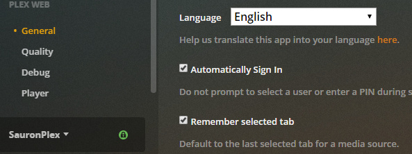
Activate the synchronisation of your Plex web app configuration into your plex account.
(Settings - Plex Web - General - ‘Show Advanced’ - ‘Turn ON settings sync’)
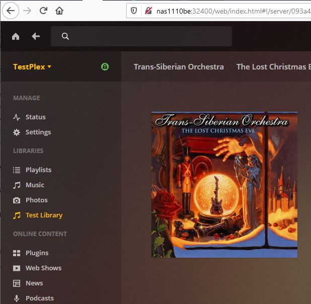
I like the presentation shown at the bottom of this comment, but it only shows on one of my servers–my only Linux server. It does not show for app.plex.tv. It does not show for localhost when using the server console or for any of my server URLs other than the Linux server. See the server name in yellow (in the image below). It is clickable. Clicking it opens a select list for all of my servers. That is so convenient and that is the presentation I want, especially for administrative access and use.
You’ve put my most-used menu option in the location that is hardest to use.
It’s silly to put a “MORE >” link way at the bottom of the list that requires scrolling to find and to make that the only way to navigate through many servers. It sure isn’t friendly to someone who tries to get a lot of use from her Plex servers.
I DO NOT WANT TO SHOW MY MOST-USED MEDIA SOURCES. Mine are all used about the same and I have many. That “most-used” presentation is probably fine for kids and casual users. That doesn’t work for me. I want quick and logical access to everything. That, to me, means following a hierarchy with servers at the top level.
I urge you to provide different user interfaces for administrative and regular use.
I’m thinking of putting no sources on my home screen menu. That would at least move the “MORE >” link up to where I can see it and click on it with out having to scroll.
Scrolling, by the way, isn’t so bad if one has a mouse with a scroll wheel.
Scrolling, however, can be downright annoying with a touch pad or with arrow keys (as on a Roku remote). This annoyance is worsened when scrolling is 90 percent of the activity one must do when navigating an awkward menu system.
Is it possible not to have a default server?
Is it possible to put the “MORE >” link at the top?
I’m pretty sure we used to be able to set the view to “Library” and it would stay there. Now it seems we’re supposed to prefer the “Recommended” view, because it always returns to it. So, that’s another click and page load that adds to the experiential cumbersomeness for those of us who prefer the library view.
I really do like improvements and new features. It’s also wonderful to see that Plex is being actively developed. I just don’t like losing something every time something else is gained.
Okay. Thanks. It’s actually the latest web app that I don’t like. It’s the version that annoys me with advertisements on the splash screen at startup, right? (You don’t have to answer that one.)
Did you know that… In Firefox, when hovering over a link, the actual web address is subtly displayed in the lower left corner of the browser window. This means that it obscures the “MORE >” link, which is probably the most commonly used link on the page.
Anyway, as it turns out, “Remember select tab” is checked. (Why don’t you punctuate your sentences?) It seems to work, but I didn’t close and reopen the session. Does that have to be set for every client? I am sure I am feeling frustration from seeing “RECOMMENDED” too often. I don’t want a damn machine suggesting music for me. I want to follow my own inspirations.
Another anyway: remembering settings is a digression from my main reason for complaining in this thread.