Server Version#: 1.14.0.5470
Player Version#: 3.77.2
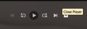
In the most recent version of Plex Media Player the Close button for the currently playing video was moved.
Please stop moving things to weird places.
Server Version#: 1.14.0.5470
Player Version#: 3.77.2
In the most recent version of Plex Media Player the Close button for the currently playing video was moved.
Please stop moving things to weird places.
It was made because it’s not a ‘close’ button, but a ‘stop’ button.
Nothing is more logical than placing ‘stop’ near the ‘play’ button.
I don’t think you’re looking at what I am.
Close used to be on the outside by the volume bar. I’ m quite used to it being there.
Now it’s after the Next button and not the Play button as you mention.
Yee, I am referring to the same.
It is now situated closely to the play button.
And it is a Stop button, not a ‘close player’ button.
I actually thought I would stay out of this debate but I decided that this deserves some comment: Plex may be calling it a “stop” button but the (x) sure looks like a “close” indicator and the net effect is to close the player.
Said button has been all over the place and I too find it confusing when buttons are moved for no reason that is clear to the user.
This seems like another case of changes being made for no other reason than to make changes.
Plex can call that button anything they like, it is their app after all, but calling it a stop button does not make it one from the perspective of this user.
In my opinion this is not the right look for the button.
Because what it does is to stop the playback.
The player overlay closing is just a consequence of the playback stopping.
The button got moved (again, I must say) because there were myriads of complaints from users which didn’t agree with its position at the right end of the player bar.
What 's even more important: there were quite a few users who simply didn’t notice it and left the player bar open, with playback on Pause. Which, as you may know as a Plex veteran, “cements” the playback progress of the media item which is open in the player.
There are dozens of forum threads where users have left the web app in ‘paused’ state. (Simply because they didn’t know that they have to stop playback completely or because they even didn’t see the button.)
Then they went to a different client and finished watching the video there.
Only to be perplexed that the playback progress of this video was still frozen at the position where it got paused in the web app!
I was also annoyed to see the close button changed location again, but I can see the logic in moving it next to the play controls. Why not place it right next to the play button, as is the case in the mobile app though? Also, please make the icon a filled square without the cross. This is the universally accepted icon to stop playback.
Another issue is the playback settings button has been moved to the right now. Clicking it opens a menu where the text is centered, so you need to move the mouse a lot farther now then before, especially on larger screens this is not very good UX. Please move that back to the end of the playback controls in the center of the bar, as is also the case in the mobile app.
Scratch this. I had the horrible Windows Store app and the PMP installed and was getting them confused.
This topic was automatically closed 90 days after the last reply. New replies are no longer allowed.
