I hope there will be an option to disable this. And please, please, please don’t add this to the Android-TV client without the option to disable it.
This would be moot if there were a “none” option alongside “blur” and Dim."
I hope there will be an option to disable this. And please, please, please don’t add this to the Android-TV client without the option to disable it.
This would be moot if there were a “none” option alongside “blur” and Dim."
Agreed… Why oh why oh why would ANYONE want to this.
Couldn’t believe my eyes when I seen the release notes. How this was prioritised over everything else and became the most important item in this update it just beyond me.
I recommend High Contrast mode in Advanced Settings.
They diligently trying to make Plex clients unusable but so far I can work around it. 
Can you post a screenshot? The link require authentication
I’m usually a big curmudgeon, but I kinda like the transparency.
I was already using Blurred though. I don’t like the transparency with Dimmed at all.
I think High Contrast is too much.
The new app loading animation is pretty, too. Doesn’t seem like it slows anything down, or I’d be whining about it. 
I agree with Volts - High Contrast is too much (although, when it first appeared, I don’t think it was SO dark). If only Plex would allow us to select 'No background," or possibly select a solid color background, as I’ve been asking for years…
The link is in the Plex for Roku announcement. It’s just a link to the Roku app store where you can install the app. It’s not really relevant to this thread, but I can’t remove it.
I suggedted High Contrast as a workaround not a solution.
These UX changes should be optional rather than trying to find ways to work around them.
I’m absolutely one of those guys, but I had to ‘Discover’ a way to view the sidebar transparency - by switching back to the sidebar while viewing an item with a background - something I’d have to be out of my mind to do normally… and I gotta say it doesn’t really put me off even when I leap through a few hoops just to get a look at it.
However - let’s lobby for an ‘Option’ and see where that gets us.
It’s worked SO WELL in the past.
The “hoops” ain’t clearly marked, 'cause I ain’t figured a way to actually see the transparent effect to decide if I like it. If it’s that hard to see, I’m pretty sure it won’t bother me too much, option or no option.
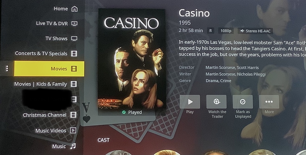
Just set the background style to dimmed, then open the sidebar while viewing a page showing a dimmed background. Remember that this is currently only in the Preview version of the Roku app.
… by navigating to the ← LEFT while viewing a media item
… and that’s something I don’t normally do. I can’t think of a reason I’d ever do that. @leelynds and I apparently have similar User Viewing Habits.
I do meticulously select the friendliest background to Dim - most are ‘right quadrant heavy’ and the left is usually fairly empty. I had to search for an item that actually had something on the left to see… and for me… it’s not that big a deal.
But let’s have that option anyway.
Everybody’s happy.
While we’re at it - let’s have a User Selectable Main Background (with an option on the side) to show behind the Home/Sidebar Welcome Area.
… and let’s fix the No Background for Collections Thing - since backgrounds seem to be a theme these days.
After jumping through the hoops to actually see the transparent side bar, it’s really not much different than it was before, to me. Like @JuiceWSA said, I don’t know when I would ever ← to the side bar from a season.
I always use High Contrast so anything else seems more difficult to read.
Here’s a couple of recent backgrounds I found/altered/fiddled with so they could be used as ‘Backgrounds’ for Plex:
If they’re too busy in Center/Left Quadrant it gets hard for these old eyeballs to see what should be on ‘Top’.
I can see why an option would be handy for those who place Foreground Images in the Background that are Busy Bees clean across the image. I would have no problem with an Option - were it to become available.
I don’t even see a background on the right.
Blurred may be hard to see.
Dimmed will be easier - providing there’s a background image loaded.
High Contrast blows all backgrounds out of the water… for maximum User Eyeball Ease.
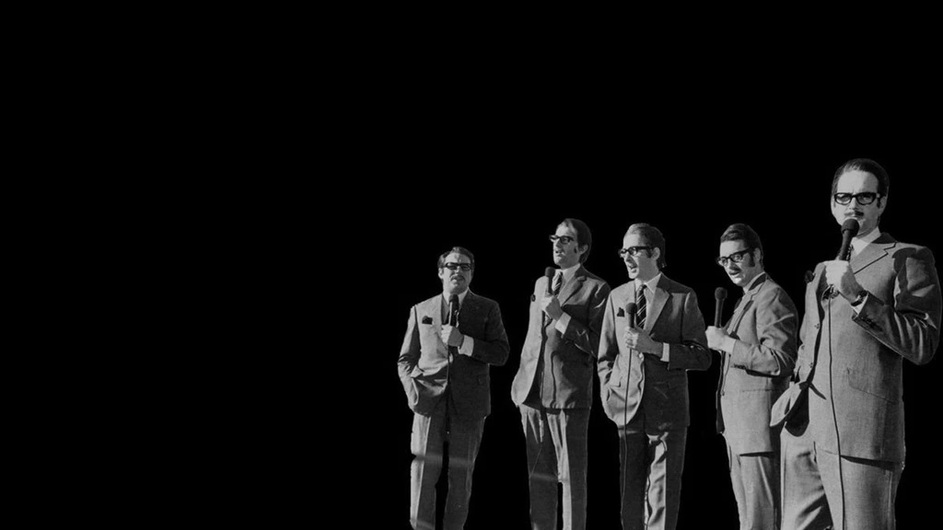
In service of the thread - here is one of the provided background images (the one I selected) for ‘Monster Hunter’ that recently arrived:
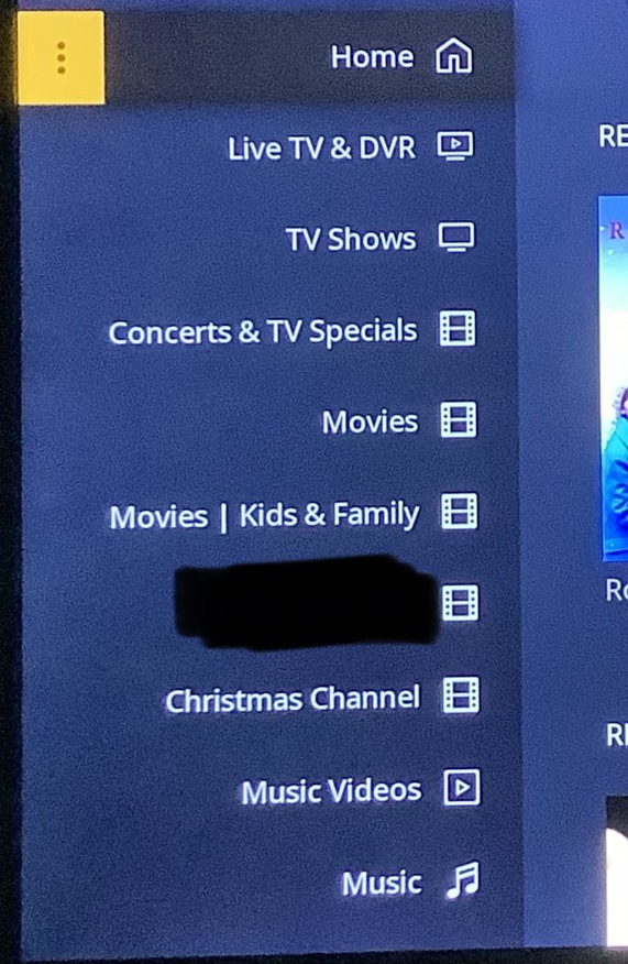
Here is the one right next to it (vetoed due to busy-ness in the left quad):
I’ll spare ya the cell phone image, but if they’re a little more busy than that under the Sidebar - I can see it being a PITA. I checked on the Roku and that second background is right on the verge of uncomfortable.
… and that one is just OVER the uncomfortable threshold. <—down in Christmas Channel and Music Video prefectures.