Agreed on all points, if I had to guess it’s an executive decision to attempt to move Plex into an aggregator of sorts for other streaming services. Which doesn’t really fit with the existing user base.
Could we please just add local library content back to the “continue watching” list? I can live with the other changes - I figured out how to browse in libraries again, and to let searches show my own content. And I do understand the revenue from the other content. But having to navigate to the specific movie or episode from the “front door” instead of resuming, is VERY VERY annoying, and just fundamentally ruins the experience. Please.
I have playlists that have different genres of TV shows or Movies. I breakout my media by category so I have TV-Comedy, TV-Drama, Movies-Drama, Movies-SciFi, etc. Some of the playlist span different genres. Putting them under multiple clicks for each library makes them extremely inconvenient to use.
Please consider moving them back under the libraries as their own category. This is my only complaint about this change. It can go in the horizontal bar at the top, that’s fine. Just please bring it to the main screen rather than buried in menus.
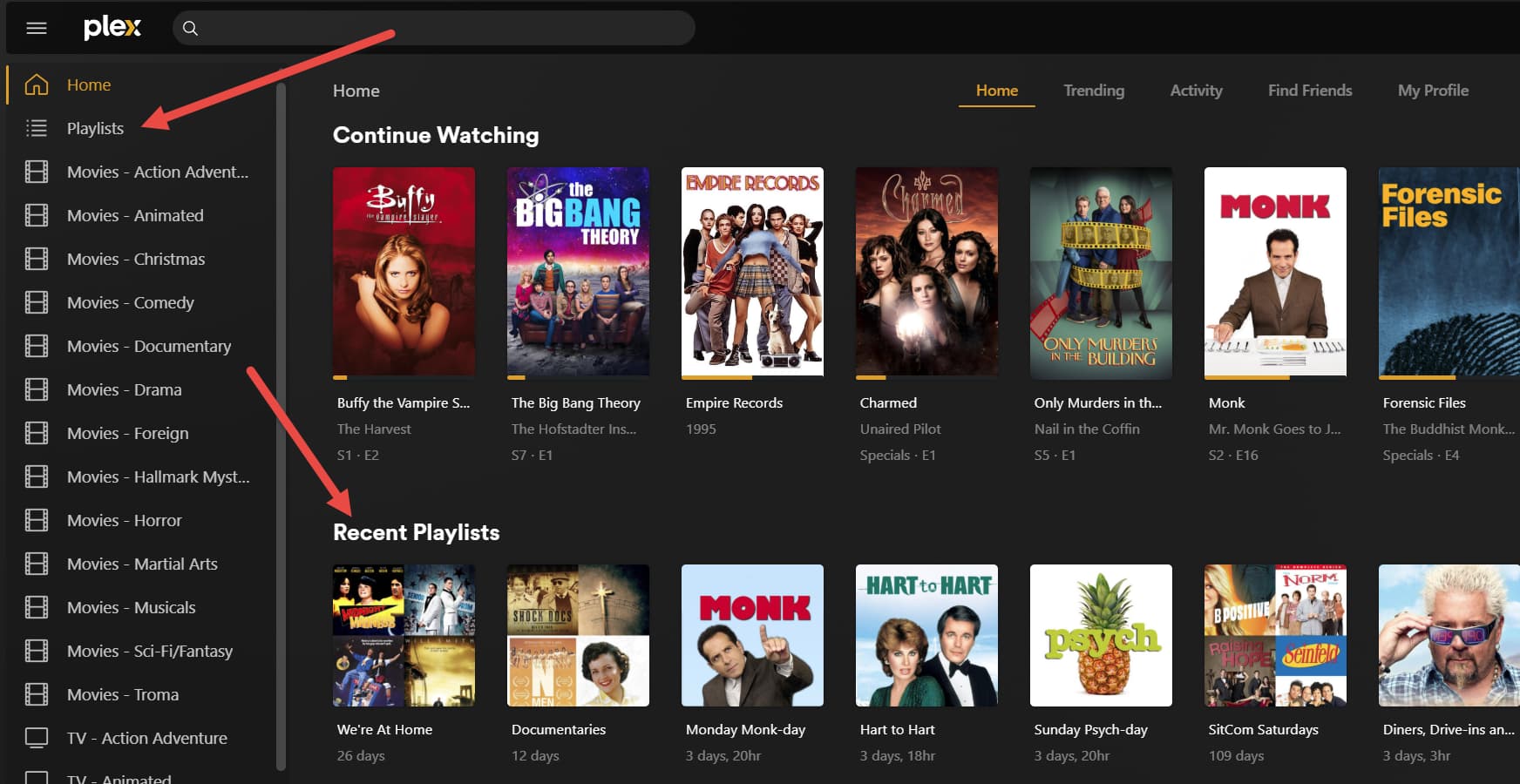
You and I have very similar library structures. I have 32 defined libraries and I find it very cumbersome to navigate. To get to TV-Westerns, I need to go to Libraries then click Right > Right > Right > Right > Right > Right > Right > Right > Right > Right > Right > Right… [You get the idea] just to navigate to it, and without actually being able to see where I’m navigating to. In the old interface, the libraries aren’t hidden horizontally so I could see where I’m going.
I disagree on that. I host my PMS for me, my wife, my family and some friends and they absolutely need to discover whats on my server.
All favorite libraries are added to Continue Watching on the Home Screen.
I feel like there are a bunch of people experiencing bugs with the new Roku interface, and thinking it is by design. Like there was someone the other day who said their Continue Watching was not appearing at the top anymore, and other people saying their own content is gone from the Home screen completely like they think Plex was hiding it on purpose.
When the one Roku device here updated, nothing about the Home screen changed (other than the Library bar at the top and no sidebar to go to).
- The Continue Watching hub is still there at the top, with the same mix of locally hosted and Plex-supplied content, displaying the partial progress on items stopped mid play.
- Hubs for our own TV show and Movie libraries were still present.
- The hubs appeared to be in the same order (Recently Added TV first, then Recently Added Movies, then Music, Plex Live TV below that, etc…)
Well, the EXACT same thing happened when they rolled out the Android/iOS version months ago. So Plex didn’t learn and fixed anything in the meantime.
Fair enough. I also host mine primarily for my kids who are spread out globally. I think it would be safe to say that for every Plex owner, there is a unique use case and a unique set of “users” that they serve. I think that has historically been one of the great advantages of Plex. I think it’s important for Plex to retain an agnostic interface, letting each person customize libraries and options for their own users and specific use case.
Well I’m not entirely surprised to see the same bugs appear. Plex can claim this new app has a unified codebase but it doesn’t seem like fixing things on one side is necessarily resolving them on all platforms. I’m just saying there are things people are assuming is user-hostile design and are not what the app is supposed to be doing in reality.
It is too bad that Plex has still decided to go ahead with the UI change even with all the negative feedback and deciding not too listen. Touting it as unified even though between different apps they can’t get it right, backgrounds on the android app are in 4:3 vs Roku 16:9 and so depending on what background size you have it either will cut it off (16:9 image on android) or look silly (4:3 image on Roku).
I’m sure it makes sense on the backend of the apps to have all the same settings and look to keep things easier to update, on the user side it just doesn’t work with all the different ways that users use plex across the different devices available.
I don’t expect much to get better due to the fact that when the preview was announced and all the great new changes that were happening like logos and the ability to change logos on server side would be implemented before the roll out. We are still waiting on being able to update the logo which is crazy, as there are some of my movies where the logo has 3D in the title (not sure how many 3D tv’s are out there now). We will just be stuck with whatever the company decides even though they keep asking for user input, but if it doesn’t match what they are planning then they just don’t listen.
I will add my request to go back to the original UI at least on Roku and hold off on any other TV platform updates until you can get start listening to your user base. Making updates that we would like to see and not what you want to push onto us.
Yeah McWanke is Director of Engineering. If you want to see who to really blame, checkout Plex’s LinkedIn profile and you can see who might be responsible.
If this new version is so buggy and people are disliking it so much, how about rolling back to the classic version that was “working” and functioned easily… not this convoluted, reimagined, clunky, disjointed bad idea…. PLEASE…
What about this: The new Roku UI DOES NOT show all my libraries—some are missing, even though they appeared on the old Roku app, and they appear on the PC UI. Yikes!!!
So if I favorite every library their content will all appear if I watch part of any individual show or movie, more or less just as before?
Remember, PLEX was supposed to be an EZ means for the end user to have a media server setup the way the ”end user” wanted it… Not how PLEX wants it…
That’s how it was going until this reimagined ROKU release… DOH…
Also, when I go to a library, why is it defaulted to always display in “Recommended”? Who’s recommendations are these? I dislike this option, I want it to be “Browse” and the previous version would remember that, this version always defaults to “Recommended”, so it’s just more annoying clicks to do what “I” want…
As of now, I have not experienced any of the functional issues that other people have described. This update is another example of shuffling a user interface around for no reason and without adding any meaningful features. Let me make one thing clear: The new UI is not better. I don’t care what any designer or engineer has to say about that. All it manages to do is frustrate users because they have to re-learn where everything is. This is the kind of thing that may not have bothered me as a free Plex user, but now that I have bought the lifetime pass, I am pretty unhappy.
As I was typing my last post, I realized that when I select a movie to watch it, my carefully-curated posters have been replaced with generic transparent logos. Surely there is a way to change this, but I can’t find it on the web client. I can’t even find a way to choose a specific logo. If neither option is unavailable, this is an absolutely unacceptable change.
There is a setting under one of the gear icons (I think the one near the top right, IIRC) that lets you set the default behavior for libraries to be “browse” instead of “recommended”. As far as I can tell it’s one setting that applies to every library rather than being able to be set on a per-library basis, but I could be wrong about that. Still trying to work my way through this awful new interface.