This is the standard “Admit no fault” until they start losing business, then do a turnaround and say “Oh golly gee, whodathunk?”
And here I am, changing to Emby so my elderly family members aren’t completely furious that they now have no idea where their shows went or why I can’t fix it.
I just saw that there is a PMS update available. I took a look at the release notes and didn’t see anything about changing the webui, but after this kerfuffle, I’m inclined to not even try updating my server. Has anyone else updated and can you confirm if it hosed-up the webui?
Hate to pile on but I too am extremely frustrated with Plex on Roku. It has been increasingly glitchy for more than a year. Optimistically, I was hoping the developers would work things out. But no joy.
They (whoever they are) made a questionable decision to add new features and/or ui changes on top of existing broken code which only exacerbates the problems. Doesn’t matter which Roku device, the bad experience is ubiquitous. Basically, I have experienced all the same issues listed in the multiple feedback in this post.
To add another problem that may or may not have been mentioned: Going into Settings is also buggy. After selecting 2-4 options (submenus), the app won’t accept any input. And if you change a setting, it locks up the entire Roku. Nothing registers including trying to bounce out of the Plex app using the Roku home key. It requires unplugging the Roku. So instructing users to go into settings to adjust their experience is only leading to more frustration.
I used to love Plex. It’s ashame to see it lose its focus for a quality experience. One UI for all platforms is a pipe dream and backward-thinking (i.e., 90s and early 00s). If your target pop is truly the younger generations, learn them better. Their expectation is not “one ui for all". The desire for one ui is only focusing on the company’s desire to not support more than that. Devices differ too much for that to be a reality. If you start with the fact the Android os isn’t a consistent experience across devices, versions, etc., it makes sense that Plex shouldn’t be either.
The Interface is mostly CSS. It’s just rearranging the look of the interface like a web page. Actually, it’s basically a web page. They don’t have to rewrite the codebase under the hood. As they have said, the same functionality is behind the “new experience”.
All they have to do is put it back the way it was, push it out to Roku, Android, etc., and then begin adding code changes to bugs. There were very few bugs prior to this disaster of a release.
I saw @bengalih’s quote and entirely agree that his usecase mentioned is the one that I indeed miss the most. The back button is overloaded and not good for navigating.
In other words, if you’re viewing a library, it doesn’t matter where in your collection you are, you can just hit the left arrow a bunch of times and it’ll take you to the library list (which the libraries on the left are the best way to view them as the current way with horizontal alignment makes it hard to see more than 2-3 libraries at a time)
With the back button, if you hit back a bunch of times you get a prompt to exit plex and basically accidentally “overshoot” the library list.
There just are too many ways to click past what you want now when trying to get the cursor to exactly land on libraries and find your library. The old way was foolproof. Left left left left. hit it too many times, no biggie, too many times and it keeps you at the nice list of libraries that also expanded to see the full title of libraries that may be a lot more text.
I now have so much stuff on my screen I don’t want, can’t hide it. App is slow. And I now have 20 more clicks than I ever used to.
It’s clear the aggressive push for on-demand is taking over at plex. Plex pass wasn’t enough to live off of.
For the love of God roll it back. I know some people must have worked hard on this and you don’t want to waste the time and resources that went into it. But you should. Mothball the whole new UI. There was literally nothing wrong with the old one.
Who was asking for this?
Quit ■■■■■■■ with the ui and work on other core stuff. People give you their money because they like your product. Stop changing it.
Just restarted my Plex app and now none of my cover art works. Unreal.
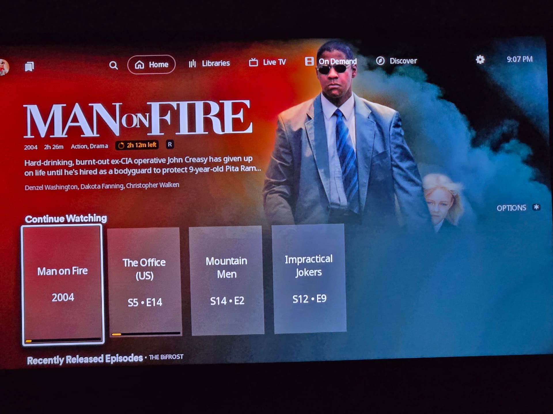
Left Menu for libraries - as has been mentioned by many, this is the #1 feature that makes the new interface awful and hard to navigate. Horizonal listing of libraries is counterintuitive. Plus, once a library is selected, it’s not possible to know what library is actually selected. I truly believe if you bring back the left library navigation, most of the negative comments will go away. Library Favorites: you mentioned above there were considerations of how to remember library favorites. I like the favorites to be able to set per device. Some devices we only watch movies on, and others only TV shows, so it is helpful to have them independent. Yes it is nice also to sync, but perhaps that could just be a user option to sync or not. I can see how deciding which way to go is difficult on this.. In a perfect world, we would have a “master favorite” list that all devices sync to, unless a specific device option is selected to not sync and then it could set its own.
Everyone. Plex is scrubbing comments. I will be retaining counsel on this unacceptable action. To be clear. I used no threats, just that this UI change is ridiculous.
Since the new UI update, nothing that I have added since the update will play. It gets stuck on loading. Just a circle. Doesn’t even show a %. If there isn’t going to be a rollback, I can’t imagine that I will wait weeks, months to watch something I added today when an update is finally released to fix all the issues. Testing and QA is an important step that was clearly not done well.
I don’t know if this already exists, but if not, would it be possible to get a thread or page that is just status updates on this from the Plex team? I get it, the new version is flawed and you are working on it, but I don’t want to have to scroll through hundreds of angry user messages to find employee updates on here. I am fine waiting it out while you scramble to clear the backlog but seeing some kind of expected timeline or acknowledged issues or something in a centralized place would be helpful.
Thank you. I was hoping for something more along the lines of known issues being worked on in the next release, like a service desk experience or sprint ticket list or something. That at least gets me what has been done which is helpful.
I was/am getting this HOWEVER when I went up to the “libraries” bubble and clicked it, a drop down of sorts appeared. As I went from each of my libraries (sideways meh) some populated and some did not. Movies are identified as TV shows and TV Shows are identified as movies but the content (or at least in my case) is there. It’s just wildly scrambled. I’m hoping it resolves into a more logical format by morning since I just now realized any of it was there and I just set up my server today. Part of my problem is that it’s trying to pull from the old sever which doesn’t exist anymore.
The UltraBlur or whatever it was called effect here is a bit too heavy. I think someone else might have mentioned it elsewhere, but it really is too thick over the background image. Like, the background image is easier to see when it’s displayed as a preview, because the opacity of the color layer is lower: