This top row does disappear for me when I navigate to a details page for a movie on my server (it disappearing is the intent). It also disappears for a VOD movie and when I go to a movie/show details page from the Discover source. Can you help me understand where you are NOT seeing this top nav row disappear? And also call out what version you are running (I am on Roku 8.0.1.10224-168ad2c1f-PlexPreview)
Mine does not appear on those pages too, and I would prefer to have it instead, however, if it slid in on those pages, that would probably be good compromise.
It’s currently a huge problem on the mobile app (android) not having the main menu available. You can dig yourself down multiple layers (following cast → cast movie → more cast → etc. selections) and there is NO way to get back out quickly. You have to hit back repeatedly. I believe iOS has a OS method to get you back with on click.
1 Like
This is probably going to be one of those split preference things. ![]()
On TV I’d prefer to have it as it is - disappear on detail pages. I can give a functional reason at least from my experience.
I can hit “Back” once on my remote to get to whatever screen I was browsing before entering details and then “Back” again to get to the now displayed navigation row if that’s what I want to do. If the navigation row is on a details page how do I go back to browsing the library or collection or season\show level when I hit “back”? If HOME\Library\LiveTV row is on details page what do I hit differently now so I can continue browsing titles or episodes if “back” works like it does everywhere else the navigation row is and jumps there now instead? I don’t think it works.
The navigation being on detail pages would work on mobile\touch screens though with touch and gesture options being available and not tied to remote buttons. Though like Kilgry said there’s tricks there already - though the iOS trick of holding down back to jump up multiple levels isn’t that well known (based on supporting iOS device use in the past). And it’d introduce another “not the same experience” thing. Though that’s already kinda broken up between mobile and tv\web (see the background art comments and threads).
Tip for Roku Remote:
If folks aren’t using the back button on Roku much - give it a try! It works pretty well for jumping around faster than d-pad controls; like on Home if you’re a few titles in on a row, hitting back once takes you to the front of the row and hitting it again takes you to the continue watching row and then again takes you to navigation. It pretty much worked this way on the current UI too.
Also - hitting Play instead of OK from Home starts the title playing right from there. I had a habit of sticking with the D-Pad controls for everything so I’d hit OK and then OK again from muscle memory instead of just hitting “Play” to start playback right from browsing screens instead of detail screens.
I only mention this because I had the muscle memory probably from gaming of keeping my thumb on the d-pad and not using Back and Play buttons myself for too long. ![]()
1 Like
Try this:
- Go to a movie
- Select a cast member
- Select a movie they are in from your library shown on their bio page
- Select another cast member from that movie
- Select a movie they are in from your library on their bio page
- Select another cast member from that movie
- Select a movie they are in from your library on their bio page
Now you will need to hit the Back button 5 times to get the navigation to show again. Unless I’m missing something.
Another one is the fast forward and rewind buttons in the menus. Sometimes they scroll an entire screen with one push.
1 Like
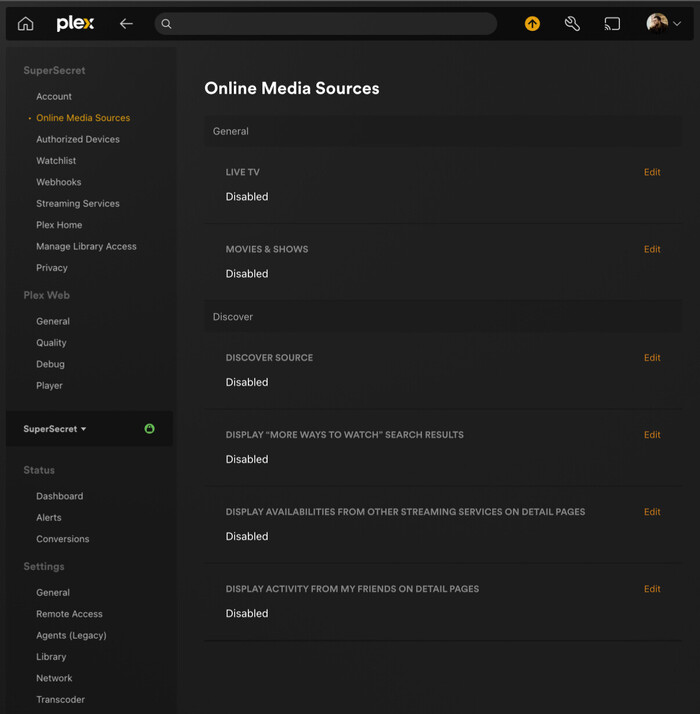
How can I hide the “Discover” icon at the top? I can do it with the old version, but not on this preview.
Go to " Online Media Sources" and DISABLE everything.
1 Like
No, you’re not missing something… that’s how it works today in the current UI and Experience. I hit Back and I travel through the previous screen breadcrumbs to where I started from - keep going and eventually return Home (keep going and will be offered to sign out). That’s how I expect it to work though so I don’t see a problem.
You’ve not actually given an example on how adding the Search\Home\Library navigation improves things for me in that scenario because I’m almost never trying to get back Home, I want to go back to the screens I was in before. To be fair, I rarely go 3 levels deep of cast\movie detail screens but it does happen. ![]()
It’s an interesting idea so it’s kinda caught up my mind now.
How often are you going into details and then want to jump to your Home Screen or another library instead of returning to where you hit the detail screen? Maybe that’s a difference of use I don’t understand. And if it was added, how would it work smoothly?
Let’s say Search\Home\Library\DVR is put on those detail screens and I hit Back - what happens? The idea here is you don’t wanna hit Back 5 times to breadcrumb to where you were, you need Navigation in as few remote button presses as possible, so how does that work out? How is it handled between wanting to return to where I was and jumping to that navigation menu - and it’s gotta fit with how jumping to navigation menu is expected to work in other screens too right?
How often does being able to hit Back to get to Search\Home\Library from a detail screen become more efficient day to day use than hitting Back to return to the previous screen you were on?
Keeping in mind using the new navigation menu is more clicks than it used to be - in some cases I like the change but in general it’s more button presses get to different areas now.
Another example.
I’m looking in my Star Wars Collection checking which Star Wars movies had that one guy in them I can’t remember but I know he’s in a Star Wars movie by bouncing in and out of the movies in that collection because I remember his face but not his name. Right now I click Okay to select title, click d-pad to scan cast row (if they aren’t in the first several), click Back to return to collection. Switch title and repeat until I find actor - go into detail to check bio and the other titles they’re in (which luckily includes movies in my library with Edition tags now - yay!). Found the guy so now I click back 4 times and I’m on Home in navigation menu: Back to Movie, Back to Collection, Back to Left Navigation, Back to Top Navigation (I think… it might be 3). At any point I can break outta that path if I don’t want to go all the way Home and navigate other movies in the collection, other collections in the library, browse the library\recommend screens. How does that scenario work with Back jumping to Navigation like it does on every other screen Navigation is present instead of Back being a “return”?
If you aren’t proposing removing the “back = return” in favor of “back = navigation menu” on the detail screens then how do you include both “return back to where I was following breadcrumb” and “jump to Navigation menu” without making it feel clunky switching between detail screens?
I guess an alternative in order to have both things work is to make Back still “return” to previous screen like it does now for detail pages and then UP on d-pad can take you to Navigation kinda like it does for selecting Seasons when on a Show detail - but that’s not great because on TV Show details screen you’ll now have two horizontal navigation UI (Plex, do not move seasons to left hand navigation - though it’d probably fit in that huge empty space that’s there now) and hitting “back” 4 times is still gonna be faster than hitting up, up, up to get to navigation on a details screen with a bunch of horizontal selection options and then clicking through those navigation options. If you try to make the left d-pad the “return” that’s going to have worse problems I think particularly since that’s changing what everyone is already used to and how it works for other Roku native use expectations. Plus Back jumps to Home in other screens that have Navigation menu so now there’s a discrepency if it doesn’t do the same here.
I just don’t see where efficiency is added for daily use with the extra complexity required to manage it. I can click Back to return several screens pretty fast compared to clicking d-pad and OK multiple times. Kinda like preferring my swipe gesture on my computer touchpad for going back several pages in my browser history is less effort than moving my mouse cursor up and using the back button even if it might be faster overall because I don’t have to make multiple different maneuvers … heh… “maneuvers” is kinda grandiose way to put it but I’m leavin’ it. ![]()
I’m not trying to pile on you or anything, just trying to be detailed trying to sort it out. If you can maybe give an example of navigation added to detail screens would improve things that’d help. Not that you have to prove anything to anybody … it’s just interesting. ![]()
I forget about this one all the time!
Another… you can hold down the dpad direction to scroll through items - I use that a lot for scrolling down the ABC selector and scrolling down my library titles. ![]()
Sorry, where is this? I don’t see it anywhere in the Roku app.
I don’t actually want to disable online media sources. I just want to hide the Discover tab like I could in the old Roku app.
Online Media Sources is in the server settings, and it would universally hide them across all client apps.
If you’re just trying to hide the discover tab, I don’t think will be possible moving forward.
1 Like
I mean behaviour on the home screen.
I usually do it from a web browser. Under settings (wrench).
You can probably just disable the Discover options.
https://app.plex.tv/desktop/#!/settings/online-media-sources
You can’t do it per client anymore. It’s disable global, or have it present everywhere.
Which is just another decision I can’t comprehend.
There’s nothing wrong with server-wide settings. But different apps/devices are used by different persons and/or for different purposes/use cases. Why the heck did somebody think that it might be a good idea to take away app settings in favour of “feature on/off” settings on the server???
Actually, these are the Plex Account settings. They aren’t part of a server’s config. Otherwise people who do not run servers themselves would not have access. ![]()
3 Likes
The top 9 categories here actually live/are stored/affect at the account level. Server-specific settings live under the Settings header underneath your server name. It does get a bit confusing since things like Manage Library Access are still in that top grouping, but that actually requires account-level functions like user account lookup (even though once set it operates at the server level) hence why it is grouped like that.
Not Roku Preview specific but the “Title Art” on many titles is just not good or is wrong. Lots of variations on wrong language, wrong title (AUS title for US release for example), bad layout or formatting making it look weird, or simply can’t be read at all. It’s just inconsistent in so many ways that I really really want to have control over it. I’d turn it off but on title’s that don’t have art, the text used is so small it just creates an awkward gap in the TV UI.
I was trying to look in the forums for how these clear logos are being pulled\used\managed and didn’t really find anything.
There’s this request: Logos as a local asset … but I don’t really want to manage logos manually as a local asset. I’d like to manage logos like I do posters and backgrounds; which unfortunately has become more work with the licensed artwork defaults often being kinda bleh already but at least I can fix them easily when necessary.
Edit: Did find where dev seems to be indicating selecting logos will be similar to posters and background before Experience leaves Preview (dev comment) - though Mobile is already on Preview and that comment was before that happened so who knows. Also seems, based on that same thread, that there is some validation but that it’s not very good yet. Lots of good info about Clear Logos in that thread - just took me a bit to find it.
Plex released an update to Plex preview - 8.0.5
FIXES:
- Fix focus loss on the bottom and side slide-out options.
- Fix for multiple Libraries or Live TV sources being selected at the same time.
- Fix issue where Live TV OSD channel was incorrect.
- Keep focus on related hubs after non-PMS details refresh.
@ljunkie, Plex TV Live Guide for Plex Channels is not showing Date or Season
Only shows E1 (when it should show Season, Episode, Date and Rating (I.e. TV-MA)