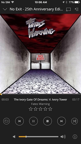
When playing audio, the button layout in Plex’s player seems outdated. My main gripe is that the play button is difficult to press - it is the same size as surrounding buttons, and it’s not centered. Case in point:
I recently saw the Android layout, which looks much more modern. The play button is made easier to press by size, centering and color. Part of this was made possible by removing the unnecessary volume slider (as there are hardware controls for volume). It is also better because it has seeking controls (skip back, skip forward). Which would be particularly useful for all those audiobooks I just added to Plex!

Should I trust an update along these lines is in the works for the iOS player? For reference, here are the player button layouts in Spotify and Apple Music (iOS 10), which have also adopted easy-to-target play/pause buttons.

