I have 32 libraries, and I feel the pain
Please complain at https://www.plex.tv/contact/
I did. What a ■■■■ show!
I agree ! Paid for Lifetime and there should be a “Classic View” selection.
As I stated in my own thread, my autistic brother is having a lot of difficulty with the new design. While I would love a “classic” interface option, at the very least we should be able to pin specific libraries to the navigation row without the need for multiple clicks to get to the one we want.
I just tried Plex on my phone app. My Android phone app and realized it is doing very similar things. Showing all my old HP 14 server library’s first and as favorites. It does allow me to remove them and pick at least two of my real favorites, but when I back out and open it back up it’s all like it was before. So not just in the Roku app apparently
I think if y’all are paying real attention to the feedback, some sentiments and keywords are abundantly clear. This UI change is frustrating, unintuitive, causing many of us extra time and work trying to train and troubleshoot for our other users, and virtually everyone wants selectable libraries and left side navigation back. I truly do not understand why any of the return communication has not been, “we will do that,” when the feedback is so incredibly loud and clear. If anyone up there is wondering why people are angrily suggesting you don’t care about your users, perhaps things like these can shed a light on why.
I dearly hope bad rollouts and worse communication isn’t an example of what’s to come. What happens when we give other future feedback about what WE want? More of the same, “we hear you,” that isn’t followed with improvement but instead more buggy new app changes and reduced features that even people who participate in the testing are confused by? Who is it at what level of authority that isn’t hearing the rising volume of dissatisfaction? I brought my users to Plex by telling them they could watch my movies, not by telling them they could be beta testers for an app that might not work half the time.
Was playing around on the Roku here (it’s not mine so I haven’t gotten much of a chance to before now), and I noticed when I go to the library list on Home, the libraries are listed with the name of the Plex user sharing them listed underneath. Shouldn’t it be the name of the server instead?
If I look something up on search, it’s going to list the server name for where it’s available – not the person. Also, what if I had two servers operating? How would the Roku user be able to tell which server each pinned library is on?
Yes, appreciated that @mcwanke posted an update, but in reality the response was, “we are not listening to any of you and this new version is here to stay. We might fix some bugs”.
I do not like any part of this update and in reading the forum, it seems no one else does either. So my question to @McWanke is the same as many others, why fix something that wasn’t broken? What was / is your goal? I find nothing about the update to be intuitive and so many functions are gone or crippled. It is like going into my favorite cafe and the menu now has only coffee or toast. It’s a mess and someone might want to acknowledge that.
no no its more like going to your favorite coffee cafe & deserts and now they only serve water with ice milk and burnt toast
It would be highly beneficial to have the opportunity to explore how the new user interface functions. Unfortunately, I am currently unable to connect to my Plex server using a Roku device following the recent update.
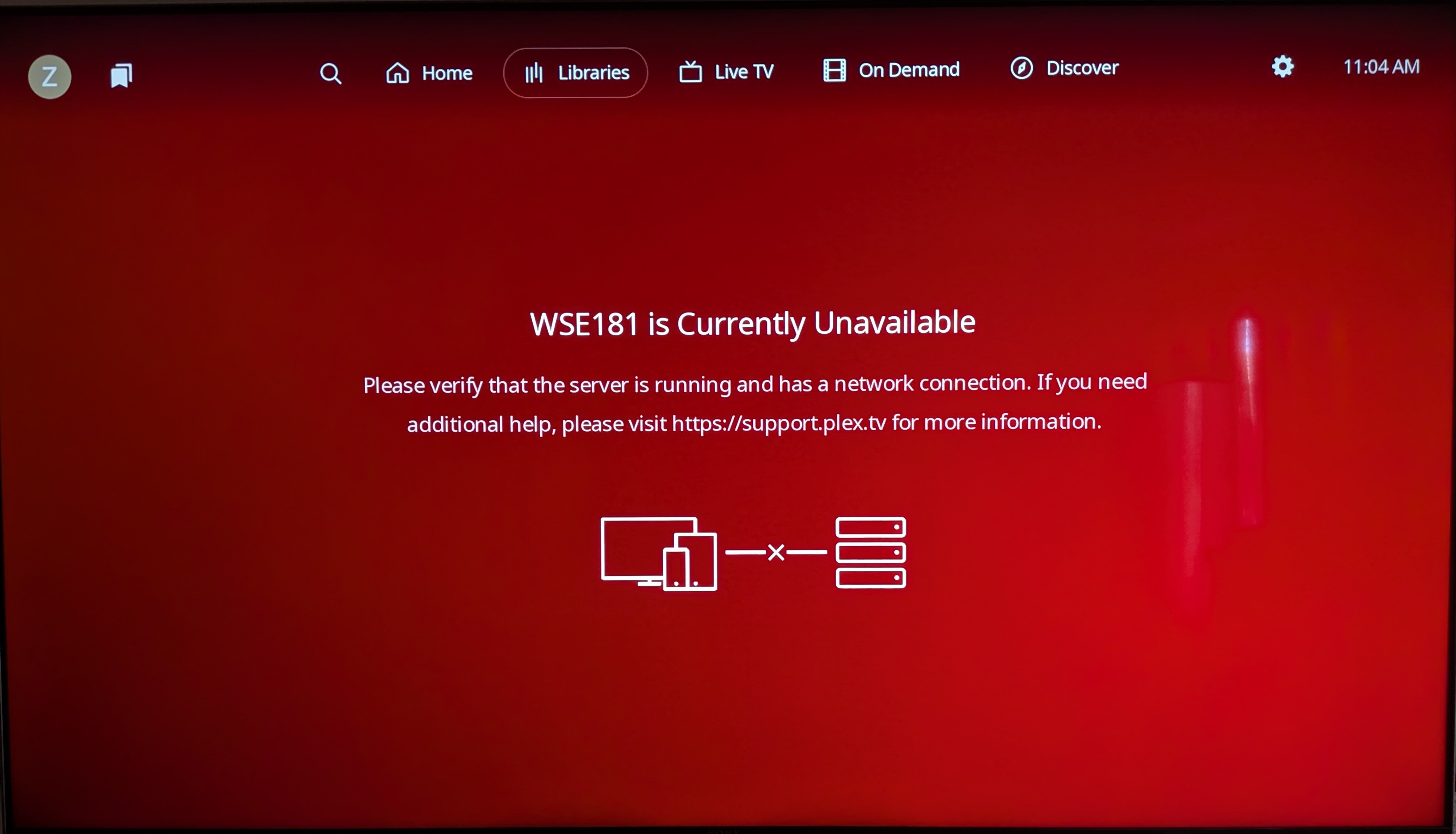
I am still waiting for a solution from Plex employees. I have already tried their suggested fixes, including uninstalling, restarting, power cycling, and checking the firewall. Everything was working fine at 1:30 AM, but when I came home and turned on Plex, this screen appeared. Nothing has changed—no Windows update, no Roku update, nothing except their app update. Could a Plex employee assist? I would like to understand what all the excitement is about.
I use 2 servers and my primary server has disappeared when using the Roku UI. I cannot see any way of looking for it or adding it. Also, all my file artwork is gone so the icons show a screen clip rather than a movie poster.
I cant even watch anything anymore, whenever I select libraries on the top menu it just crashes. Christ.
For all those interested, I started a feature suggestion way back when this top nav mess hit mobile. Go give it a like if you’re so inclined. Maybe we can get some traction.
I was told to provide feedback here. Not sure why I can see Plex doesn’t listen to its users. Lifetime member here. I’ll be looking elsewhere for an app after this awful garbage update. Just leave things alone it was fine the way it was. Terrible.
I thought they were supposed to fix that - it was discussed and acknowledged in the beta testing but I only have the one server myself. Guess it’s still on the “to do” list? Might be worth a dedicated topic with screenshots rather than buried in here.
- The new UI horrible!
Found a another extra crappy thing about the new UI last night. Now my 5 year old autistic son is confused why he can’t find his favorite movies and TV shows and I get to deal with his frustration now too.
Thanks for this special hell!
Guess I need to look for a replacement, for your now crappy software that I used to love and promoted to everyone I knew.
Not any more!
There is a word for this. Ensh*tification.
I only have one server right now, too. And I don’t feel like spinning up another to illustrate this. If it’s acknowledged already that’s fine. It’s just an inconsistency in navigation to refer to sources by user in one screen, and by library in another. Likely they are prioritizing issues that impact usability and playback even if this seems like a fairly easy fix.
Throughout recent history, we have seen this same paradigm play out over and over, and yet companies refuse to learn from it.
Take the simple example of Microsoft and Windows 8. Microsoft determined, without user input, that they want to “improve the user experience” and make the PC experience the same as a mobile experience. Why? Nobody knows. Their customers never asked for the change. But the company developed a solution to a non-problem in a black box, and then forced it upon users under the guise of “improvement”. Predictably, users hated the change and found Windows much harder to use. Microsoft lost customers, credibility, and suffered massive financial losses as a result. Windows 8 had only a 15% adoption rate, and Microsoft had to walk it back, releasing Windows 10, which was very similar to where they stated (Windows XP) before this whole debacle and cascading losses happened - and it took more than a decade and a whole division re-org to recover from their loses.
It all could have been avoided by asking customers what they want, if anything, and then making those changes. Users know what they want and like, yet companies like Plex and Microsoft still think they know better. How often do we have to watch history repeat itself?
The new app is terrible, this response is annoying and not helpful at all. My family hates the new app, navigation is more complicated than what they were doing, and now they’re asking me for alternatives. Given this response that just shrugs off everyone’s feedback, I agree with my family: maybe it’s time to move on.