I was really hoping this meant the clock was going to be present in this release. Hope it’s soon.
In swapping back to Public as primary use for now after using New Experience for the last few weeks here are a few things that came up.
- All that extra padding on the left side really stands out when switching between Public and Preview; the entire experience feels off-center and weighted to the right side of my TV screen on Preview. On Preview I feel like I’m seeing “less”.
- Missing the clock - I know y’all said it’s coming back eventually but I really really miss having it and is primarily why we switched back to Public as daily use - just part of our habit from several years of having it there so very noticeable that it’s gone.
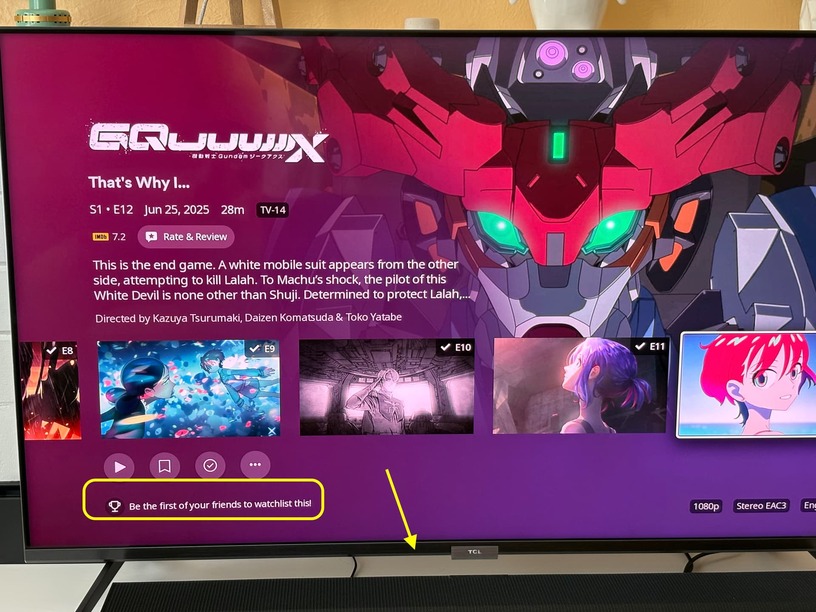
- The new Show tab in navigation row on TV detail pages is nice to have but the show\season tile in the episode list is jarring\weird for multiple reasons detailed at that link.
The fact I can’t go to a Show or Season level on a single season show in Preview also feels odd (it’s not in overflow menu either). I can see why there wouldn’t be much need for that in cases of single season show but it’s less uniform now. Since “Show” is now in the navigation row with Season I think it’d be useful to go ahead and make that more uniform and display the show\season navigation row even for single season shows. - Those awkward navigation choices just feel unpolished but don’t come up a lot in daily use; in other areas it’s better - See #5
- The new back button functionality on Home on Preview is a good update I think - when scrolling across a hub row hitting “back” jumps me to the first item in that row, hitting “back” again takes me to continue watching row, hitting it again takes me to navigation menu. In Public “back” takes me directly to navigation row, which I got used to and some may prefer, but I have come to prefer the Preview navigation myself as I am primarily moving through Home rows for content selection and playback, not jumping to other areas of Plex.
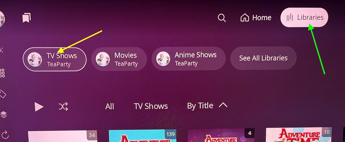
- I’d still like the Libraries row removed from Home as it definitely feels redundant and weird to click past since it’s a different size\height on Roku Home compared to other rows and with the limited Row visibility already. At the very least I’d really like to be able to turn it off like I can with any\all other rows on Home.
- About the row visibility - having only one row at a time visible with only the header of the next row barely showing above the TV edge makes it feel like there no “more” to scroll down. Particularly with the next row after continue watching being the library navigation row. The public version includes a bit of the tops of the posters for the next row which makes it possible to identify a bit of what’s in that row and feels like Home extends past the bottom of my TV screen. The way it is in Preview feels like it stops at the edge and there isn’t more to Home but a Continue Watching row. That Library row makes that even more so in a way since it’s a short row for navigating to a new area rather than content - which is already at the top of my screen in a dedicated nav bar - so you’ve pushed my content quick access via recently added and recently released or custom rows and instead bracketed Continue Watching on my Home Screen both top and bottom with “navigate somewhere else”. Preview doesn’t feel like it naturally promotes scrolling down the rest of Home Screen to access my content like Public does. If that makes sense?
- I still like the “dimmed art” option in Public for detail pages and that it stays static and fills the screen while scrolling those details but I don’t mind the Preview way of scaling art into place either. It’s a preference that may be nice to have as options to customize maybe. The snap-in of the art on Public doesn’t feel as smooth as the scaling animation on Preview so that’s nice that it works decently even on my clunky Roku TV but it could probably still use some optimizing and some work with centering the art better maybe (and sometimes it still flashes a previous background).
- It takes a bit longer to play media. It’s only by a bit but Public gets into playback faster than Preview. I assume that’ll improve over time though. Preview interface itself, on the other hand, is snappier than Public.
Overall, New Experience Preview has been fine. Less of a problem than I initially thought it’d be and if the majority of items mentioned as feedback are acknowledged over the course of Preview before being sent to Public - not like how the mobile apps where handled - then I think Experience will generally be an improvement over the current Public version (though that show\season tile “new feature” decision has renewed my apprehension and I already lost confidence in community feedback having any real weight or appreciation). I only use Plex on Roku for one local Movie library and two local TV libraries so my use case is a focus on navigating and playing back my content so my priorities might not be the same as folks who use LiveTV or Plex Movie\TV services and such.
Not really “Preview” related but it might be useful to mention the Roku remote button functionality in intro screens after install or major updates maybe? Not all apps follow or use the same scheme for buttons - the YouTube app doesn’t play your selection if you hit “play” you gotta hit “OK” but in Plex hitting OK or Play do different things and folks might not realize you can start playback from home rows by hitting “Play” instead of having to hit OK twice - I forget sometimes myself if I’d been using YouTube a lot. AppleTV on Roku does some funny things too so depending on the services folks have it can set different muscle memory that might make Plex feel more clunky than it needs to be. Maybe something in settings area can have some controls info like they do for video games? Not everyone is going to come dig through support articles about button functions (which aren’t really in the support articles anyways) and not all of them are intuitive between Roku channels\apps.